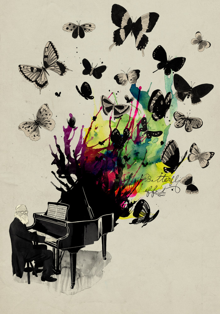
Tuesday, October 27, 2009

11 Fantastic Photoshop Tutorials Brought to you by Computer Arts

I'm a fan of Computer Arts and they compiled a list of 11 great photoshop tutorials. I definitely recommend checking it out. They have some tutorials that will definitely help your art stand out.


Create awesome ethereal artwork with Photoshop’s Warp tool
Design duo Shotopop show you how to turn plain source images into inspired art the easy way


Make action images more dynamic in Photoshop
With dynamic distortion and a little Photoshop magic, you can introduce speed to your subjects. Doucin Pierre, aka Soemone, shows you how


Add magic to your photos in Photoshop
It doesn’t matter how powerful Photoshop is – great results still depend on the skills of the user. Per Gustafson shares his expert advice for making mediocre photos magical


Create striking portraits from a pencil sketch
Hoang Nguyen explains how to create a simple composition, lay out an interesting background, and define the light source

CLICK HERE TO VIEW THE REST OF THE TUTORIALS

Roughen Up Your Vector Work- From Computer Arts


I saw this at Computer Arts and thought I should post it for those who may have not seen this. This starts from a hand drawn illustration, to illustrator, and finished in Photoshop.

DOWNLOAD PDF TUTORIAL

DOWNLOAD SUPPORT FILES

Thursday, October 15, 2009

Mathiole Interview By DesignByHumans.com


Mathiole(http://www.mathiole.com/website/) is an artist that I enjoy following, because the pieces he come up with are so compelling. They're very vibrant and he knows how to use watercolor to create very interesting and sometimes funny art. He's won many t-shirt design competitions, especially from Design By Humans, which is probably why they interviewed him. He is only a recent college grad, so his work will be interesting to watch mature. He's a one question and answer from the interview:

When I think Mathiole, I think watercolors- in designs like Ecstacy and SeaSick Symphony, you’ve used those huge splashes of color to great effect! How did you start to develop this style? Do you have any tips for other artists who would like to begin experimenting with watercolor?

Well, it was a natural choice. Since I was a kid and started drawing, I hated colored pencils, crayons and pastels. I tried oil-based ink, acrylics, but didn’t like the results. Then, when I started my drawing lessons, I started using Ecoline (like a liquid watercolor), and from that I got better results and became more interested for colors. In college, right from the beginning, I had classes about the theory of color, and it helped me a lot, because although practice is very important, theory helps us see through things.

Using watercolor was a natural choice of my style, from the moment I decided not to do images which were purely digital and started searching for the beauty in imperfection of the handmade drawing.

A lot of people ask me how I do all this watercolor effects. Well, they are not effects, they are made in paper, it is real watercolor, only scan it! We live in a time so digital and technological, and that to me seems do alien some artists. They forget they can use a real brush, instead of a Photoshop filter. So my tip is: practice! And don’t be afraid to experiment. Forget a little about Photoshop and Illustrator and look for real effects. Not only with watercolor, but with everything! Use charcoal, coffee, whatever! Even if those experiments don’t bring an immediate result to the work, with time there will be evolution. You can’t be afraid to make a mistake or be lazy enough to practice.


CONTINUE READING HERE


Wednesday, October 14, 2009

6 Ways on How To Make Friends & Influence Art Directors


This is an interesting article. Mike Davidson created a list to help prospective designers who are curious on how to enter the competitive design industry. Here are the first two he has on his list:


1.Your portfolio is a whole lot more important than your résumé. Whenever I’ve had to fill a design position, I’ve always gotten tons of résumés and ended up going straight to URLs without even looking at the education or other qualifications of the applicant first. There are just so many people in this industry who are “all talk” that I’d rather hire someone whose stuff looks great but maybe hasn’t had a chance to go to a great college or work at a great company yet. The best thing you can do for yourself, résumé-wise, is to put together a nice one or two sheeter and offer it online, complete with sample URLs. That way, you make it very easy for whoever will be evaluating you as a prospective employee.

2.With regards to your portfolio, spend every spare minute of your time on it. Nothing impresses me more than a clean book filled with thoughtful work. It doesn’t matter how big your clients are… only how good your work is. You should create imaginary clients if that allows you to flex your design muscle. I would rather see a beautiful poster for an imaginary band than a lackluster design project for a big company like Boeing. In other words, you will never be judged on the size (or existence!) of your clients — only the quality of your work.


Read the rest here

Thursday, October 8, 2009

MUTO-A Wall Painted Stop Motion Animation

I remember seeing this a couple years ago on the PackFM section of the Qn5 Music messageboard while talking about graffiti. I remember my father who's an emmy award winning video editor that sent me this. I figured why not post it up for those who may not have seen it or haven't seen it for awhile. This video looks like the artist used a ton of paint. It's definitely incredible, because of the work that was put into it. Check it out, it's rather entertaining.

Wednesday, October 7, 2009

Masking & Transparency in Illustrator Video Tutorial

Here is a tutorial that I found over at the Black Axe blog It's a brief overview on how to use these and can be very useful in your work.

Masking & Transparency in Illustrator from The Black Axe on Vimeo.

Tuesday, October 6, 2009

Branded Baron T-shirt "Astrohop" Available Online


Branded Baron released this new shirt and I designed it. I was excited to see it printed up and it looks really hot. I had thought of creating a hip hop astronaut that's style is out of this world for over a year. It seems like astronauts are becoming a trend as late, but I had this idea for awhile. It came to see the light of day not too long ago. It was printed on a light blue shirt that is very soft. It's definitely fashionable, so if you purchase and want it baggy, get it a size up. There's a video of this design being printed on the Branded Baron blog http://www.brandedbaron.com/blog This design was fun to do and I like that I put part of the moon in the helmet. This is definitely a Stunningly Fresh shirt. You can purchase this shirt here http://www.brandedbaron.com/product/astrohop

Check out the rest of the Branded Baron site, I created a bunch of designs for this company. http://www.brandedbaron.com

Use the promo code "deviant" in the coupon box and you'll have 12% off your entire order.

Thursday, October 1, 2009

Jeff Finley Interview on Colorburned.com


I've been a fan of the Cleveland design firm, Go Media for a couple years, since I was back in college. Jeff Finley, one of the owners of Go Media, is someone whose work that I always enjoyed. I even remembered when he was under his freelance moniker Mylkhead and I would look at his site. I enjoyed his illustrations and his designs. He created some crazy typography for various companies, one being Paint the Stars. He released some very well done tutorials on Gomediazine. Here is an interview that is informational and it can help out other designers who are working to reach their goals.

Colorburned.com interview
Go Media's Website.
Jeff Finley's Personal Portfolio Site