Showing posts with label logo design. Show all posts
Sunday, January 27, 2013
New Orleans Pelicans Logo
The NBA New Orleans Hornets will now be the New Orleans Pelicans when they play their 2013-2014 basketball season. The pelican is Louisiana's state bird, which makes sense why they changed their name. It also has the Fleur de Lys which is another symbol that represents New Orleans. I personally like their new logo and their secondary logos. I feel the colors work well and that overall logo has a classy look and modern style that compliment each other. The pelican itself is okay even though I feel the head and bill isn't that recognizable compared to the wings. I think the angry aggressive look is fitting and shows a fierce bird that many people who are not from Louisiana will consider to be a non threatening mascot when they think of the word "pelican".
What are your thoughts on the logo? Is it simple enough? Does it work well with what the team wants to be portrayed as?
Labels:
basketball designs,
basketball logos,
fleur de lys,
logo design,
louisiana,
louisiana state bird,
nba logo design,
nba logos,
new orleans hornets,
new orleans pelicans,
pelicans,
rebranding
Tuesday, July 3, 2012
Wreck-It Ralph Logo Treatment
Michael Doret posted on his site the logo treatment for the new Disney Pixar movie "Wreck-It Ralph". I love seeing the process of a design and it was really cool to see what the preliminary sketches were to the final design. Look at one of the prelim sketches below
(Double click to enlarge)
To check out the whole post click here.
Labels:
design process,
disney,
logo design,
logo design process,
logo process,
michael doret,
pixar,
wreck-it ralph
Tuesday, November 8, 2011
Fraser Davidson Interview at Noupe.com
Noupe.com has an interview with motion graphic designer and sports branding specialist Fraser Davidson. Being that I enjoy sports branding, I thought this was an interesting article.
Here is a comment he made regarding on what his process is like regarding sports logos:
"Its important that logos have movement and the feeling that you have captured a particular attitude or emotion"
Read the interview here
Labels:
branding specialist,
fraser davidson,
logo design,
motion graphics,
noupe,
noupe.com,
smashing magazine,
sports branding,
sports logos
Friday, September 16, 2011
Jay Wise Shoelace Design Process
It's been awhile since I posted a design of mine, so here is the latest creation. Hip Hop artist Jay Wise is a "sneakerhead", he literally has two closet full of sneakers and he wanted his name created in shoelaces. I originally took a pair of shoelaces and tried creating his name with them. I wanted to get the shapes, take a picture, and work on it on the computer. Well, the shoelaces did not go as planned and were quite difficult to form a letter, although I was able to create a mean "O", but there's no "O" in Jay Wise. I decided that sketching would obviously work best, so I sketched it out and finally came up with one I liked.
*Serious inquiries only if you are interested in having me design a sneaker shoelace design
The design was only going to work in script, but I wanted it to be fun and wavy. I felt I was able to achieve that when I worked on it in Illustrator. I like the text by itself, but felt it needed an outline, which I feel is better. Lucky for me, Jay loved them both, so they'll be used in designs for him.
Feel free to comment
Labels:
365 days of art,
365 days of creativity,
design process,
jay wise,
logo design,
shoelace,
shoelace text,
shoelaces,
shoelance font,
sneakerhead,
sneakerheads,
wale
Monday, August 15, 2011
Make Correct Use of Colors in Corporate Logos!
Colors all have meanings and here's a quick explanation on what each colors means, so next time you're designing a corporate identity you know what will work best for your client.
Click here to read.
Labels:
color meanings,
colors,
corporate,
corporate identity,
logo design,
logos
Monday, January 24, 2011
365 Days of Creativity -Day 24
This is the Darth Vader design that I was working on. I call it "Oakland Vader". I was listening to a Swollen Members song where "raiders" and "darth vader" were rhymed and the concept hit me. Also, I think it fits since it's still football season. I recreated the shield, the font, and of course I drew Darth Vader's head. It was a fun little concept to work on.
By no means am I a Star Wars geek. I don't understand the whole Star Wars obsession, because it's an okay series. Entertaining, but not worth going gaga over. Darth Vader is a badass character in general, so that didn't bother me. BUT if anyone from the Lucasfilm Ltd or anyone has a license rights to Star Wars characters, I would create some really good designs.
Labels:
365 days of art,
365 days of creativity,
art goal,
darth vader,
logo design,
nfl logos,
oakland,
oakland raiders,
oakland vader,
teefury
Wednesday, January 5, 2011
Starbucks Refreshes their logo
Starbuck has decided to give their logo a new look. It is important for companies to give their a logo a little update every x amount of years. Sometimes it's good and sometimes it is bad (Pepsi). There's not much difference in the new Starbucks logo and it looks as though they said, "less is more." For most cases "less is more" works and Starbucks has made a huge impact, that they could use their mascot icon. I feel it is effective and recognizable. So whoever refurbished their logo, did a good job.
Labels:
corporate design,
corporate identity,
identity,
logo design,
new starbucks logo,
pepsi,
starbucks,
starbucks coffee,
starbucks logo
Friday, December 31, 2010
Recent Works in 2010
Here were some stuff that I was working on or worked. Here are some sketching, logo work, and various art pieces, whether they are completed or not. The one above is a sketch that I'm brought into the computer and will be touching it up in Photoshop.
Hungry Andy's was a logo design for this new sandwich shop down in Baltimore, Maryland. This is only the black and white version.
This was a fun pinup sketch, that I would like to continue working on.
Woman paint like sketch.
Playing around with the wacom pen with this woman laying down sketch.
Negative Woman
This one wasn't, but I just wasn't satisfied with the outcome. It says "Champion" in Spanish.
Labels:
adobe photoshop,
anatomy,
digital painting,
female form,
holiday sketch,
logo design,
logos,
pin up art,
pin ups,
sketch,
watercolor,
watercolor effects,
watercolor paintings,
woman watercolor
Saturday, July 17, 2010
Logo Lounge's Article on 2010 Logo Trends
Logo Lounge has an article every year discussing logo trends. Some of them I agree with and see all the time and other's not so much. Designer and Logo Lounge head Bill Gardner discusses details that are now much more important than before. Here is a blurb from his article,
"brightness in hue has become pervasive, likely due to the public’s eye being thoroughly trained now for light-projected, on-screen color. We now live in a RGB, not a CMYK world."
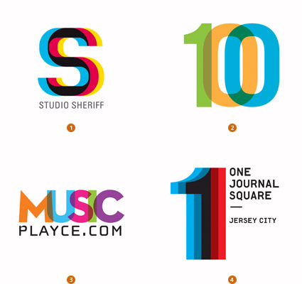
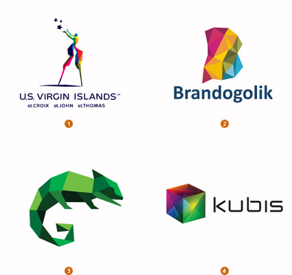
Some of the current trends today in logo identity are Cubists, Shift, & Parts(although I see this in many designs not including logos, but one example is the new Expendables movie). Plenty of circular designs have surfaced, especially when the last Presidential race was happening. I recommend you read the article, maybe you're creating some of these trends already or maybe you might. So if you need some inspiration when you're in a creative block check out this link. http://www.logolounge.com/logotrends/
Labels:
bill gardner,
cmyk,
cubists,
logo design,
logo lounge,
logo trends,
parts,
presidential logo,
shift
Saturday, June 19, 2010
New Golden State Warriors Logo....Eh
It seems that the design trend is go retro. Everybody wants to reminiscence or take it back to what it once was. Well the Utah Jazz reverted back to their old logo that was in '96 and now Golden State wants a retro feel. They want to show homage to the old uniforms from the '60's. When I was growing up in the 90's I never liked any of the Warriors jerseys. The blue and gold looked too plain and I thought the California state on the jersey looked terrible. I thought it was a sock, until one time I realized it was California. It made sense after that, because why would they have sock when they were the warriors?
This what Warriors President Robert Rowell had to say about the idea for the new logo:
"The throwback uniforms we've worn as part of the NBA's Hardwood Classics initiative in recent years have been extremely popular with our fans, and we set out to design a new look that was clean and traditional in that same spirit. We are grateful to the NBA and adidas for providing us with a magnitude of creative freedom, along with invaluable expertise, during this process."
Now I'm not upset that they went retro, but what bothers me is that it doesn't look like it's a logo for a basketball team. That looks a generic Bay Area logo with the team name around it. It's simple, which is fine, but it doesn't mean it is creative or good. Also, there wasn't a better font than Copperplate? That's a generic font that I've seen other companies use for ads and logos.
The current logo was cool, but clean. It had a mascot of a warrior with a mask holding a lightning bolt showing they're ready for war. The basketball in the background had a slight finesse, but it wasn't boring. It just seems frustrating that companies pay big bucks for crappy designs. The designer probably took down all the correct information, but just put together a bunch of ideas together and the Warriors probably wanted simpler.
I'm not a Golden State Warriors fan at all, but when I was growing up I always had fun coming up and drawing my versions of all the NBA team logos. I feel my 7yr old self had a better logo for the Warriors then they do now. I'm disappointed since I like sports logos.
This what Warriors President Robert Rowell had to say about the idea for the new logo:
"The throwback uniforms we've worn as part of the NBA's Hardwood Classics initiative in recent years have been extremely popular with our fans, and we set out to design a new look that was clean and traditional in that same spirit. We are grateful to the NBA and adidas for providing us with a magnitude of creative freedom, along with invaluable expertise, during this process."
Now I'm not upset that they went retro, but what bothers me is that it doesn't look like it's a logo for a basketball team. That looks a generic Bay Area logo with the team name around it. It's simple, which is fine, but it doesn't mean it is creative or good. Also, there wasn't a better font than Copperplate? That's a generic font that I've seen other companies use for ads and logos.
The current logo was cool, but clean. It had a mascot of a warrior with a mask holding a lightning bolt showing they're ready for war. The basketball in the background had a slight finesse, but it wasn't boring. It just seems frustrating that companies pay big bucks for crappy designs. The designer probably took down all the correct information, but just put together a bunch of ideas together and the Warriors probably wanted simpler.
I'm not a Golden State Warriors fan at all, but when I was growing up I always had fun coming up and drawing my versions of all the NBA team logos. I feel my 7yr old self had a better logo for the Warriors then they do now. I'm disappointed since I like sports logos.
Labels:
basketball,
golden state warriors,
logo design,
logos,
nba,
nba logos,
oakland,
san francisco,
sock,
sports logos,
utah jazz,
warriors
Subscribe to:
Posts (Atom)