Showing posts with label sports logos. Show all posts
Monday, March 12, 2012
Cavaliers Sports Logo
Here is another sports logo that I created and mocked up on a football helmet. I'm practicing making sports logos, so I decided to create one for a team called the "Cavaliers." I chose the colors for the helmet has well. I wanted to have the sword and shield with the "C" in the middle and felt that could be worn on any athletic gear.
Labels:
cavaliers,
cavaliers logo,
cavaliers logos,
cleveland cavaliers,
football logos,
fraser davidson,
how to draw sports logos,
joe bosack,
logos,
sports logos,
the joe bosack graphic design co.
Monday, February 20, 2012
Sports Icons -Free Download
Check out this link by Naldz Graphics that provides you with a bunch of sports icons for your design needs. Whether you need NFL helmets, NBA icons, cycling, boxing, or any other sports icon in your design then you should visit the site. Click here to view and download what you need.
Labels:
boxing,
cycling,
extreme sports,
free download,
freebies,
nba logos,
nfl football,
nfl helmets,
sports icons,
sports logos,
sports vector
Gridiron League by Wes Kull
Football season may be over(Go Giants!), but that does not mean you cannot enjoy the logos designed by Wes Kull. He created this personal project to pay homage to the vintage football logos of the past. I have to disagree with him saying that some of the newer logos for some of the teams do not do the football team justice by ignoring their heritage. He may think that they're too commercial, but I think that's fine and it still gives the logos a badass modern twist. Anyway I'm not here to argue his thought on that, but to showcase what he has done. Some of these look good and some not so much. Wes admits that not all of the teams needed a revamped logo, which I agree, but if you're going to redesign a team you might as well do them all. I definitely applaud him for his effort and think his goal was reached. You can view all of his Gridiron-League logos at http://gridiron-league.com/
Labels:
cargo collective,
football,
football designs,
football helmet,
football logos,
gridiron league logos,
gridiron-league,
logo redesign,
logo revamp,
nfl logos,
sports logos,
wes kull
Friday, January 6, 2012
Sports Mascot Logo- Grizzly Bear by me
One of my goals is to create more sports logos/mascots. I post every now and then of sports logos and mascots, so this is another one, except it was done by me. I always wanted to create some bears mascot and here it is. I chose the colors for the helmet and the face mask. It's okay, I'm not completely satisfied, so I'm sure my next go around on a bear mascot will be a lot better.
Labels:
bear logos,
bear mascot,
bear mascots,
chicago bears,
face mask,
football,
grizzlies,
grizzly bear,
how to draw sports logos,
joe baron,
joe baron design,
nfl football,
nfl logos,
sports logos
Wednesday, November 16, 2011
VIDEO: How To Draw Sports Logos: Text Beveling by Fraser Davidson
I was looking at Fraser Davidson's site and he has a couple videos on creating sports logos. You can definitely check out the rest here. I happen to really like this text beveling tutorial and it was helpful. Maybe it'll be useful for you as well.
Labels:
fraser davidson,
how to draw sports logos,
sports art,
sports branding,
sports logos,
text bevel,
tutorials,
youtube tutorials
Thursday, November 10, 2011
Coventry Bears by Ink Tycoon
One artist who's mascot I work is Mike Ray from Ink Tycoon. I'm sure if you used iStockphoto and looked for certain illustrations you may have come across his work. His creations are vector and clean, I know, because I had to find an image for a project one time and I ended up using one of his. I can appreciate good vector art and I also like mascot logos. I wanted to share with you his branding for the Rugby team Coventry Bears. You can see the sketch and the final result with the logo on the team jerseys.
Sketch
You can see the logo being worn on the left side
Labels:
coventry bears,
coventry bears rugby league,
fraser davidson,
ink tycoon,
mascot,
mascot logo,
mike ray,
rugby league,
rugby logos,
sports logos
Tuesday, November 8, 2011
Fraser Davidson Interview at Noupe.com
Noupe.com has an interview with motion graphic designer and sports branding specialist Fraser Davidson. Being that I enjoy sports branding, I thought this was an interesting article.
Here is a comment he made regarding on what his process is like regarding sports logos:
"Its important that logos have movement and the feeling that you have captured a particular attitude or emotion"
Read the interview here
Labels:
branding specialist,
fraser davidson,
logo design,
motion graphics,
noupe,
noupe.com,
smashing magazine,
sports branding,
sports logos
Friday, June 3, 2011
Michael Weinstein NBA Logo Redesign
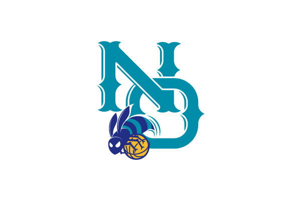
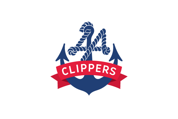
I came across this site via someone's twitter feed and this was great. I like sports logos, because they're so cool, bold, and iconic. I'm continuing to come up with some well illustrated mascots and my own logos. Since I grew up a fan of the NBA sports entertainment, I always wanted create my own logos of the teams. Michael Weinstein decided to redesign some teams and give a brief history on the chosen teams. I think they're pretty well executed. He adds a very clean look for the logos he recreated. My favorite is the New Orleans Hornets logo, but the Clippers comes close. I disagree with his comments on some of the teams older logos, but that's my opinion.
You can read each case study here or see all the ones he designed here.
Labels:
clippers,
la clippers,
mascot,
michael weinstein,
nba,
nba logos,
new orleans hornets,
sports logos,
sports mascots,
twitter
Monday, February 28, 2011
365 Days of Creativity -Day 57 & 58
Day 57- This was going to be used for a Branded Baron project, but most likely will not be used. The concept was to create a baseball theme, specifically the Yankees, but use their nickname the "Bronx Bombers".
Day 58- Here are a glimpse of some different variations of a design for Branded Baron. One of these designs will most likely be printed for Branded Baron.
Labels:
365 days of art,
365 days of creativity,
baseball designs,
baseball logo,
branded baron,
bronx bombers,
new york yankees,
sports logos,
yankees
Thursday, February 24, 2011
365 Days of Creativity -Day 53 & 54
As you may have seen on the day 52 sketch, I was working on some illustrations. I've taken it to the computer and still working on it.
Day 53-
Day 54-
Day 53-
Day 54-
Labels:
365 days of art,
365 days of creativity,
drawing ducks,
duck design,
ducks,
mighty ducks,
sketch,
sports logos,
sun designs,
sunglasses
Tuesday, February 22, 2011
365 Days of Creativity -Day 48, 49, 50, 51, 52
Day 48-Sketching ideas for a baseball design
Day 49-I admit this was rushed, because I was out all day and had about 2 minutes of free time. I still like the idea of the stick figure climbing up my page.
Day 50- Random sketches on one of my sketchbook pages
Day 51- I wanted to create a simple horror poster by learning this shadowy figure technique. I know what I want to do next time I create this design.
Day 52- I know I had to kick up my 365 days of creativity up a notch, so I sketching and came up with some I look forward to working with on the computer.
Day 49-I admit this was rushed, because I was out all day and had about 2 minutes of free time. I still like the idea of the stick figure climbing up my page.
Day 50- Random sketches on one of my sketchbook pages
Day 51- I wanted to create a simple horror poster by learning this shadowy figure technique. I know what I want to do next time I create this design.
Day 52- I know I had to kick up my 365 days of creativity up a notch, so I sketching and came up with some I look forward to working with on the computer.
Labels:
365 days of art,
365 days of creativity,
baseball designs,
bomb,
design poster,
female form,
gig posters,
horror,
sketch,
sketches,
sports logos,
woman illustration
Saturday, June 19, 2010
New Golden State Warriors Logo....Eh
It seems that the design trend is go retro. Everybody wants to reminiscence or take it back to what it once was. Well the Utah Jazz reverted back to their old logo that was in '96 and now Golden State wants a retro feel. They want to show homage to the old uniforms from the '60's. When I was growing up in the 90's I never liked any of the Warriors jerseys. The blue and gold looked too plain and I thought the California state on the jersey looked terrible. I thought it was a sock, until one time I realized it was California. It made sense after that, because why would they have sock when they were the warriors?
This what Warriors President Robert Rowell had to say about the idea for the new logo:
"The throwback uniforms we've worn as part of the NBA's Hardwood Classics initiative in recent years have been extremely popular with our fans, and we set out to design a new look that was clean and traditional in that same spirit. We are grateful to the NBA and adidas for providing us with a magnitude of creative freedom, along with invaluable expertise, during this process."
Now I'm not upset that they went retro, but what bothers me is that it doesn't look like it's a logo for a basketball team. That looks a generic Bay Area logo with the team name around it. It's simple, which is fine, but it doesn't mean it is creative or good. Also, there wasn't a better font than Copperplate? That's a generic font that I've seen other companies use for ads and logos.
The current logo was cool, but clean. It had a mascot of a warrior with a mask holding a lightning bolt showing they're ready for war. The basketball in the background had a slight finesse, but it wasn't boring. It just seems frustrating that companies pay big bucks for crappy designs. The designer probably took down all the correct information, but just put together a bunch of ideas together and the Warriors probably wanted simpler.
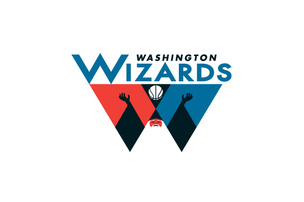
I'm not a Golden State Warriors fan at all, but when I was growing up I always had fun coming up and drawing my versions of all the NBA team logos. I feel my 7yr old self had a better logo for the Warriors then they do now. I'm disappointed since I like sports logos.
This what Warriors President Robert Rowell had to say about the idea for the new logo:
"The throwback uniforms we've worn as part of the NBA's Hardwood Classics initiative in recent years have been extremely popular with our fans, and we set out to design a new look that was clean and traditional in that same spirit. We are grateful to the NBA and adidas for providing us with a magnitude of creative freedom, along with invaluable expertise, during this process."
Now I'm not upset that they went retro, but what bothers me is that it doesn't look like it's a logo for a basketball team. That looks a generic Bay Area logo with the team name around it. It's simple, which is fine, but it doesn't mean it is creative or good. Also, there wasn't a better font than Copperplate? That's a generic font that I've seen other companies use for ads and logos.
The current logo was cool, but clean. It had a mascot of a warrior with a mask holding a lightning bolt showing they're ready for war. The basketball in the background had a slight finesse, but it wasn't boring. It just seems frustrating that companies pay big bucks for crappy designs. The designer probably took down all the correct information, but just put together a bunch of ideas together and the Warriors probably wanted simpler.
I'm not a Golden State Warriors fan at all, but when I was growing up I always had fun coming up and drawing my versions of all the NBA team logos. I feel my 7yr old self had a better logo for the Warriors then they do now. I'm disappointed since I like sports logos.
Labels:
basketball,
golden state warriors,
logo design,
logos,
nba,
nba logos,
oakland,
san francisco,
sock,
sports logos,
utah jazz,
warriors
Wednesday, May 13, 2009
Sports Stock Art (Free Download)

Whether you believe stock art is hurting the industry or helping the designer come up with something when a rush job is given, it's important to have some tools in the arsenal. I've released three sets, Random Design Elements, Grimey Strokes & Splatter, and Flourish Designs. Here is another download for you guys. This is a small vector pack containing elements of sports. For awhile I haven't seen any sports vector art around the net and all the stock art released all were very similar and stuck with the trend that is out. So here are some designs that I had to use on certain jobs that were sports related. These are sports that are in season. When Fall comes around, I might release some fall and winter sports vectors. So enjoy the baseballs, soccer or football for every non American, lacrosse, tennis balls, the silhouettes, banner, and cap. Go get your design on!
Download the sports stock art here
Labels:
free download,
gomedia,
sports art,
sports logos,
sports vector,
tshirt factory,
vecteezy,
vector art
Subscribe to:
Posts (Atom)