Some great set of photoshop brushes are up for grabs thanks to Creative Beacon for gathering them and posting it.
Download them here
Tuesday, January 29, 2013
Monday, January 28, 2013
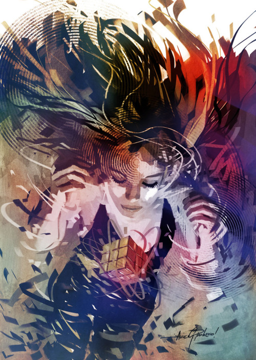
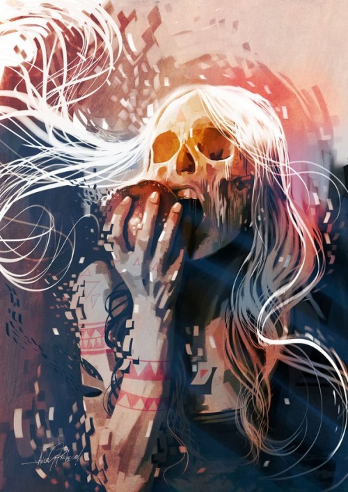
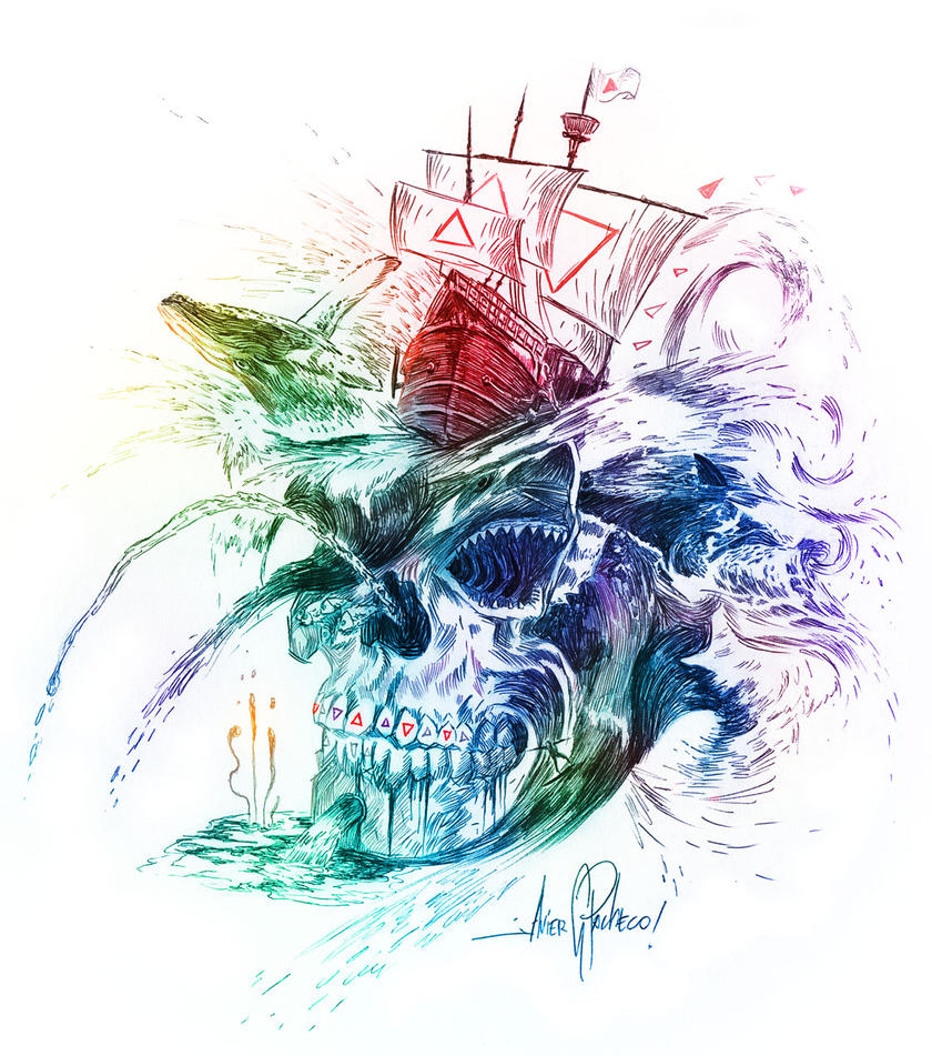
Inspiration Cool Designs by Javier Gonzalez Pacheco
Labels:
deviant art,
digital art,
digital arts,
illustration,
inspiration,
javier gonzalez pacheco,
music design,
photoshop,
skull art,
vector art
Sunday, January 27, 2013
New Orleans Pelicans Logo
The NBA New Orleans Hornets will now be the New Orleans Pelicans when they play their 2013-2014 basketball season. The pelican is Louisiana's state bird, which makes sense why they changed their name. It also has the Fleur de Lys which is another symbol that represents New Orleans. I personally like their new logo and their secondary logos. I feel the colors work well and that overall logo has a classy look and modern style that compliment each other. The pelican itself is okay even though I feel the head and bill isn't that recognizable compared to the wings. I think the angry aggressive look is fitting and shows a fierce bird that many people who are not from Louisiana will consider to be a non threatening mascot when they think of the word "pelican".
What are your thoughts on the logo? Is it simple enough? Does it work well with what the team wants to be portrayed as?
Labels:
basketball designs,
basketball logos,
fleur de lys,
logo design,
louisiana,
louisiana state bird,
nba logo design,
nba logos,
new orleans hornets,
new orleans pelicans,
pelicans,
rebranding
Monday, January 14, 2013
BaseNow "Five-minute posters"
BaseNow developed posters that were done in 5 minutes or less. They are simple with either humorous or inspiring phrases. They are certainly worth taking a look at. View here
Labels:
5 minute posters,
basedesign,
basenow,
design poster,
five minute posters,
graphic design posters,
posters
Monday, January 7, 2013
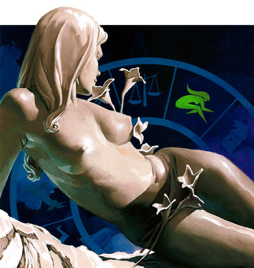
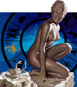
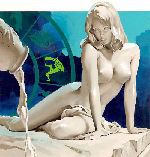
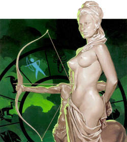
Zodiac signs by José Luiz Benício
Labels:
bralizian illustrators,
brazilian art,
José Luiz Benício,
painting,
zodiac art,
zodiac signs art
Subscribe to:
Comments (Atom)

