Wednesday, March 31, 2010

Design For Sale-Drama Skulls


This is a design that I have available for purchase. If there is any company that wishes to purchase this design, please contact me.
I created design with the intention of it going on an olive t-shirt or thermal. I feel the design works best on this color. I added a little flourish in the background to balance out the edginess of these dramatic skulls.

Photoshop CS5 Sneak Peek!

Watch this video to see what they are doing for the next Photoshop CS.

Monday, March 29, 2010

Godmachine "Witch" painting by Uzi Emperado


Filipino artist, Uzi Emperado is prepping for a solo art exhibit and so far this is his first painting for it. He was given permission by U.K. artist Godmachine to recreate his "witch" character in his own style. He is a quick 48 second video of thee progress of the painting. To view more go to http://uziemperado.com/?p=212


Thursday, March 25, 2010

Skull Speed Painting Video by T-shirt Factory

Here's another speed video for everyone to see. These videos are interesting, because they can be informative and it's interesting see what are other people's techniques and tricks. This video is from Barkone of T-Shirt Factory.

Vector skull speed painting. from Tshirt Factory on Vimeo.

Custom Sneaker Tutorial


I'm very glad I found this, because I've always wanted to customize my own pair of sneakers. I never got a clear answer when I asked anyone that did it. It was usually, "I used special paint." Thanks, that helped a lot. So I like to thank Bobsmade.com for this tutorial. The tutorial isn't so great, since you have to go through each of the pictures instead of the steps being on one page, but other than that it was very helpful. It's cool to see how they take a regular pair of Chuck Taylors. There is also a tutorial to customize your headphones.

Go here to visit the site http://www.bobsmade.com/tutorials/customize-chucks/

Check out the rest of site if you want to see what else was made and maybe for some inspiration.

Tuesday, March 23, 2010

Moonpeople Meet Spaceman by Sittingduck


Here's a video of a design process from designer, Josh Stomberg http://joshuastomberg.carbonmade.com
You can vote for this design in helping it reach it's way to being printed by going here: http://www.designbyhumans.com/vote/detail/70558


Friday, March 19, 2010

Private parts turned into cartoons

So this was a very funny video. This Brazilian cartoonist, Mauricio Ricardo made a video of him drawing cartoons, but by starting with drawings of a penis or a half naked female body. It's pretty funny and cool how the final results of each drawing look. It's naughty at first, but then BAM it becomes suitable for work. Honestly drawing the naked human body isn't perverted or wrong, just somehow society finds it obscene which it should not be at all since everyone has the same parts.

Thursday, March 18, 2010

ShirtMockup.Com is live & here's a video on how to use it

ShirtMockup.com is a creation from the Go Media design firm and it makes mocking up shirts quick and easy. You can upload your design and scale it to the way you want it. They have two shirt options right now, but if you want more, you can purchase their templates or find other templates on the web. I personally like their templates and feel that they're very well done and look pretty professional with your design on it.

Here's a video of 1/3 owner & designer Jeff Finley discussing how to use this site.

Monday, March 15, 2010

Branded Baron March MADNESS SALE!!! $10 t-shirts & more


Apparel company Branded Baron(http://www.brandedbaron.com) is having a March Madness sale. You can pick up $10 t-shirts and the other apparel are marked down as well. This is a great sale and you can pick up some cool shirts. They ship everywhere, United States or International. I definitely recommend picking up some cool shirts.

Here's a video about the sale

Simply Complicated Spring Cleaning Sale


The t-shirt company, Simply Complicated http://www.scapparel.net/ Is having a Spring Cleaning sale now until the 21st. Pick it up. They have a couple sizes left, so pick up what you can. The astronaut design, entitled Global View was even worn by Jay-Z. I personally own that shirt and I like it, it's a comfortable american apparel tee and the ink is soft.

William Beach of Go Media Answers Getting Into Graphic Design


One of the owners of the graphic design firm in Cleveland, Go Media, shares some comments on a Q&A he had. He touches on a couple things that may be useful for upcoming designers.

Here is some question & answers from the Go Media blog:

"What are some good ways to network effectively in the Graphic Design/Illustration field?
First, you have everything in your power to put yourself “out there” build a website, join design sites like Behance and Deviant Art, volunteer your services to design posters that will get exposure, join design organizations like AIGA, attend conventions and events like Weapons of Mass Creation.
Once you’ve gotten out there, you just need to be outgoing and friendly. Show people your work. And again, BE NICE. Nobody likes a snobby conceited artist. Have a genuine interest in the artists around you.

Which skills have you observed to be the most sought after in this field?
That’s easy. Web development is the absolute most important skill in this industry right now. Over the past three years our print-to-web ratio has gone from 50-50 to 10-90.
We get nine web projects in the door for every print project. Flash animation and After Effects is also growing in demand. I know designers love print-work, but if you want to be on the leading edge of the demand curve – learn everything you can about the web. In particular, study the leading content management systems and design requirements for mobile devices.

What are the qualities you look for in a business partner?
Honesty, work ethic, no ego and a take action personality."

To read the rest of the article go here: http://www.gomediazine.com/design-articles/design-industry-insight/getting-into-graphic-design-q-a-with-william-beachy/

Friday, March 12, 2010

Paul Rodriguez X Incase- Signature Skate Backpack


This is a pretty cool backpack by Incase. I think it's too bright, but it has so many pockets to store everything. I like Incase backpacks and being an owner they're pretty damn good. For more info on this backpack click here: http://goincase.com/paulrodriguez/

Wednesday, March 10, 2010

Branded Baron New Shirt "To Live Is To Fight" Available for Pre-Order


The clothing company Branded Baron has a new shirt available for pre-order. The design focuses a bit more on the mma/fight fans, but it doesn't mean you have to like that to wear it. The phrase is a powerful phrase and it relates to the hardships everyone must endure everyday. Here's some info from the website:

PRE-ORDER
"To Live Is To Fight" is the first MMA influenced Branded Baron shirt. Not only is this phrase true for the fighter and fight fan, but it remains true with dealing with the hardships that we all have to go through everyday. We have to give it our all, our blood, sweat, and tears to survive and to do what we want.

Pre-Order this shirt and get FREE shipping until this Friday, March 12,2010. Shipments of the shirts should be out next week.
There will only be a very limited amount printed, so secure your shirt by preordering it today. This shirt will be printed on Branded Baron's soft unisex t-shirts.

ORDER HERE


Tuesday, March 9, 2010

How To Design For The Apparel Market By Jimiyo

This article was written by artist Jimiyo He is a very talented artist that has won a bunch of design contests, worked for Design By Humans, and is also an art curator for Teefury.com. He is his thoughts on designing for the apparel market. Read on and ask yourself is he right? Is there truth to what he wrote?
Link to where the article originally was posted

Art Doesn’t Sell

In my experience as a designer and curator, there is a truth about the apparel world that has become apparent. If my hunch is correct, this probably spans the whole world of art:

Artsy fartsy doesn’t sell in a mass consumer market.

I don’t wish to discourage any artist from designing in their own voice, but typically, people enjoy simplicity; generic ideas, easily understood and recognizable.

By artsy farty, I am referring to esoteric ideas, themes, and execution.

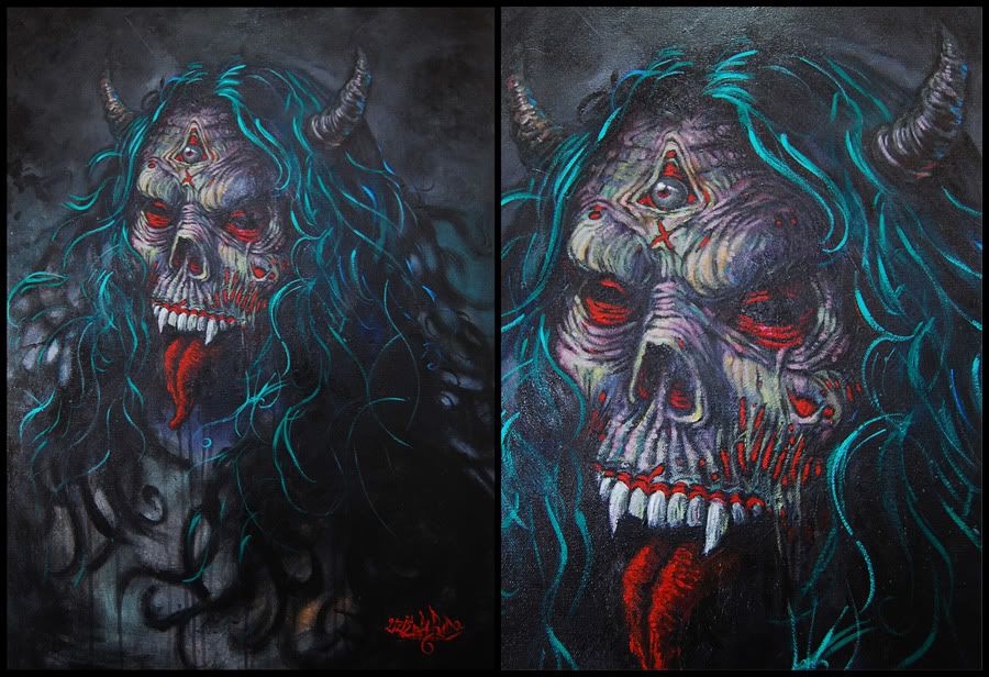
For example, my best selling shirt at shirt.woot.com was Death on a Pale White Unicorn.

Whereas Death took only 1.5 hours, the piece over which I labored most, Plunder All, was received with only mild enthusiasm by the shirt.woot market.

Whereas Death on a Unicorn is easily understood, "haha, I get it, its... Death on a Unicorn, plain and simple, but whats this pirate about? He has brass knuckles but he has Love tattooed on his fist? And whats with the octopus with the keyhole in the head?"

Plunderall is not.


One may argue that shirt.woot is a vacuum in which the preferences of the consumers are very specific, but this is not the case.

In most avenues I’ve observed, there is rarely an exception.

Teefury.com started out attempting to be like their sister company Designbyhumans by starting out selling very artistic designs, then over time, the market tended to gravitate towards a Threadless-y Woot-y genre but uniquely Teefury-y.

It seems every business tries to dictate it’s theorectical market, but eventually the consumers from the web will eventually put them into a niche.

At Teefury, since we sell a different shirt every 24 hours, we still have a wide selection of genres we offer, but the obvious winners are pop culture related.

I’ve sold over a dozen shirts through Teefury. In the beginning, I started with artistic designs which took hours to create, and years of refining my skillset.


But to date, wonder what’s been my best seller? Ceiling Cat and Darth Tut. Both pop culture references.


What made my artsty fartsy designs fail? Frankly, unless you are in a niche market like Design By Humans, the majority of the population does not have the palette or affinity for esoteric expressions. They simply don’t have the ability or desire to understand a different language.

We are still very much like animals. We still exhibit the fight or flight tendencies in our decision making. We desire social validation and acceptance as community beings so if you apply this theory to products, we want a product that communicates a positive and acceptable message to the rest of the world. We don’t want to scare anyone into thinking we are different.

To wear something that is difficult or even unable to be understood, you might as well be wearing something with a foreign alien language.

We live in a world of symbols. Male/Female bathroom signs are universally understood. The color red, a sign of urgency, skulls typically represent death, etc.

As artists, we can help to create new symbols, but we must teach the world first before they understand it and are at ease with it. So there are two paths.


1. Design using symbols that already exist.

2. Be the forerunner in defining a new set of symbols, or way of expression, until it becomes accepted, if ever.

The latter is the true artist’s journey, so it is most difficult.

But it seems, that once you define a way of expression, you will have defined your niche, so you can rarely deviate from it once settled into popularity.

BTW, did you know that even with gallery art, the top selling designs are typically generic? Landscapes, abstracts, dogs, and portraits.

So what should you design to be successful?

It depends on your market, but typically

1. Look at trends. If you observe enough of the market, you will see consistency, an affinity for certain topics, or specific design aesthetics.

2. Include pop culture references. It’s a no brainer for Marc Ecko and Adidas to be partnering with Lucas Films to create products that are Star Wars related. Star Wars is widely understood and enjoyed.

Immediately, when people see the symbols or imagery related to Star Wars, cha-ching. You know it’s $$$$ MONEY $$$$.

If you look at Threadless, you will see alot of other topics that are pop culture/cult following related products.

Video games, zombies, tv/movies, etc.

Piggy-backing on something that’s already popular is the easiest route to getting sales, and attention.

There is a legal issue here. You must parody, or coyly design in a manner in which will allow you to skirt copyright infringement issues. Thankfully, parody is a route.

3. Keep it simple stupid. Don’t deviate too far from the normal way of expressing ideas, and don’t be complicated in artistic expression. Solid low color designs are king. You want to create a design in which, someone walking by in a second understands what they are looking at. This is related to symbols. Symbols are simple images. Just as we recognize a smiley face with a cirle, two dots and a semi circular line, you want your image to be almost just as simple.

*** Addendum by @Hydro74 Twitter
4. Emulate popular styles/trends. "uniqueness is rare and not demanded by consumers or companies thus emulate what sells with a splash of creative twist."

.....

Recently, these are a few submissions I’ve seen at different sites which are obvious winners if they are printed. These are full of win. Obviously, it doesn’t take a expert to recognize them as good sellers.

Although, the skills exemplified by these pieces are professional, I would chance to say that, concepts sell most shirts, so these could have been done by a crappy artist, and they would still sell.


.....

This is the way of the world peeps.

One of the only places I’ve been successful with my own brand of art has been Designbyhumans.com, as it’s market gravitates to being somewhat esoteric and artsy fartsy. It’s built its consumer base as such, but if you notice the shirt of the weeks/months, you will also notice that it’s not necessarily the most artistic designs that win. It’s mostly allovers, abstract designs, and designs that have a wide appeal by being mildly trendy, but not overly similar to trends already existent in the apparel market.

It doesn’t necessarily take extraordinary artistic ability to win.

.....

If you are interested in submitting for a print at Teefury, email art@teefury.com with jpeg submissions. We like pop culture.

If you are interested in submitting for a print at Designbyhumans.com, submit here.

Monday, March 8, 2010

Link To Create a Stunning Retro Futuristic Typoggraphy


Here's a link to a detailed tutorial on creating a retro futuristic type using Illustrator as well as Photoshop. Styles will fade away and some will eventually come back in a few years, so here's one that may have been popular back on vinyl art in the 80's or maybe something you would see on a Daft Punk cover. If you're a fan of typography it never hurts to learn as much as you can from various styles.

http://richworks.in/2010/03/create-a-stunning-retro-futuristic-typography/

Sunday, March 7, 2010

How To Warm Up For Gesture Drawing

Mark McDonell talks about the importance of warming up before drawing. He discusses why it's important and shows detailes sketches and practices. He also focuses on the initial stages of importance and what should come first in the completing an image. For those who do not know who Mark McDonell, he's an animation professional that teaches life drawing at Disney and Dreamworks. You can view his blog here and his youtube channel here

Saturday, March 6, 2010

Submit Designs for TypoShirt One's book!


I know I am posting this late, but since there is time to participate I'll let you all know. Typoshirt is requesting for artists that want to be published in their upcoming book to submit photos of t-shirt designs that focuses purely on typography. The catch is they want images of the physical shirt, so even if you have an awesome type design it has to be printed and for sale. Here is info from their site:

"TypoShirt One is about typography on T-shirts. It is definitely not the first publication that deals with the topic of “T-shirts”, but it’s the first one that focuses exclusively on the typography phenomenon in T-shirt culture. Only shirt motifs created explicitly with typographic means shall be presented in this publication. You can’t find so many examples of extremely expressive and fascinating claims, statements, type-images and “mobile posters” on any other piece of clothing. The transmitted messages gain a non-reversible strength and power through the motifs that are reduced to their substance, related to the form and content.
This book is edited by Florian Gaertner, Lars Harmsen, Ulrich Weiß, MAGMA Brand Design and will be published in 2010 by Index Books in Barcelona. The publication aims at graphic- and fashion-designers, but also at typographers and type designers."

Fee: There is no entry fee.
Type of work: Photography of the physical T-shirt with your own design. We're interested in the application of your design on the T-shirt, not the design files themselves.
File formats: Your presented works should be able to be reproduced at large format. Please provide highres file formats (jpg, 300 dpi, min. 800x1200px up to max. 2400x3500px). Work's original format – no cropping marks, etc. Color mode RGB. The editor will not accept responsibility for color-matching or additional color-correction of digital files.
File naming convention: When naming your files, please adhere to the following convention: YourName_01.jpg
You can upload as many files as you want

Call for entries: 25.01.2010
Submission deadline: 19.03.2010

Click Here go to their site and submit your design: http://typoshirt.magmabranddesign.de/index.php/main/status

I believe I'll submit my Stunningly Fresh design. You can purchase the t-shirt HERE or longsleeve here. You can view the design process here http://joebarondesign.blogspot.com/2009/12/stunningly-fresh-shirt-design-process.html

Friday, March 5, 2010

Inspiration: Matthew Skiff


This young illustrator/designer has been hired from skateboarding companies to bands as well as some well known indie t-shirt companies like The Printed Mind, 410BC, and Pyknic. Matthew Skiff's style is very clean and focuses a lot on line art. In a recent interview he discussed how his influence was from cartoons he watched when he a child, so you can see how the art isn't so intricate with tons of details. You can read his latest interview with IAMTHETREND.com hereMatthew Skiff interview
Click Here to View Matthew Skiff's Website


Tuesday, March 2, 2010

Fresh FREE Fonts!


Abuzeedo will be releasing every Friday a fresh new font to download for free. Woohoo! So all you font lovers, you can go download the 37 fonts that are currently available.

Click to go to Fresh Free Fonts

Monday, March 1, 2010

Link 75 Skull tees that don't suck @ IAMTHETREND


One blog I like to check regularly is IAmTheTrend. They feature articles on clothing(mostly t-shirts), art, music, and film. This one article. I think with the flooded t-shirts with skulls due to Ed Hardy & Affliction there are some creative skull tees. Now I know skulls on t-shirts have been around for a while, but it seems that they were popularized a little more when those two companies became a trend. I collaborated a t-shirt design for Branded Baron with designer Collision Theory aka A.J. Dimarucot and I have to say it would have definitely made this. When that is released I'll post it and maybe my portion of the design process. You can view the rest of the article here: http://iamthetrend.com/2010/02/17/75-skull-t-shirts-that-dont-suck/ Some of the shirts I agree with and others don't, but it must've been hard to choose the top 75. The first image was available by Public Domain Clothing.

Threadless


Disturbia


DesignbyHumans


Blackbird Clothing


Fullbleed