Tuesday, December 29, 2009

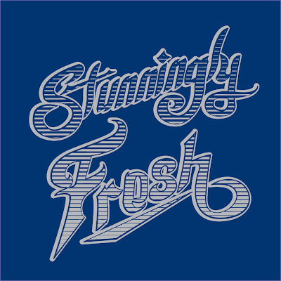
Stunningly Fresh Shirt Design process for Branded Baron Apparel


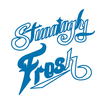
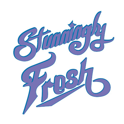
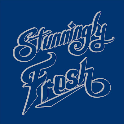
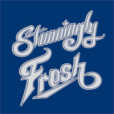
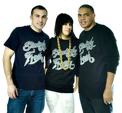
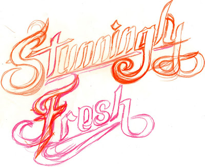
Here is a quick process of the "Stunningly Fresh" design for Branded Baron that is available in a unisex longsleeve and men's t-shirt. I started with a sketch and once I liked what I had I scanned it. From there I brought it into Adobe Illustrator and started tracing it and using the pathfinder to merge or subtract images. I added would copy and place the image on top of one another and arrange it to my liking. The color is not an important factor until the design is complete. Once, the whole phrase is complete I started deciding whether or not the whole word should be filled in with color or have the background(shirt) peeking through. I decided it would be a cool look if there was a gradient. So, I had to bring the image into photoshop and play with the gradient tool and change it into a bitmap, before I brought it back into illustrator to finalize it. After that, I brought the phrase back into illustrator and live traced it, so it becomes a vector image. I arranged it and played with the colors. I thought Gray on a Navy blue shirt would be a nice color combo. Branded Baron ended up using that for the t-shirts and Gray and Black for the long sleeves. That's a quick little insight of the process of "Stunningly Fresh."
-Joe
http://www.brandedbaron.com/product/stunningly-fresh-longsleeve

http://www.brandedbaron.com/product/stunningly-fresh


Monday, December 14, 2009

Amazing Bruce Lee Typography Illustration From Only His Quotes


I'm a Bruce Lee and he was a major influence of how I got into martial arts, so I enjoy seeing really cool images of him. I remember having created Bruce Lee stencil design that I had in my dorm room. I don't think I still have the file, but if I do I'll post it in this blog entry. Here's a very amazing illustration made up entirely of Bruce Lee quotes. It uses the background to fill in the shadows. I like the grungy background and the choice of colors. It's catches your eye especially having the text of his body in white. To check more from this artist, Devin Schoeffler go to http://www.ds9creations.com/site.php
-Joe

Friday, December 11, 2009

Idea Killers-Illustrative Comparisons

I thought this was a very funny image. I'm sure some of you out there relate to this. I know I've encountered at least one of them.
Enjoy.

Click on image to enlarge

Thursday, December 10, 2009

Graphic Design Blender's 51 New Year resolutions for graphic & web designers


This is always good to do for the new year. It's best that you start your list right away, but if you want to wait until January 1st, then that wouldn't hurt either. Graphic Design Blender's 51 New Year Resolutions, do some of them apply to you? We all should try to improve our skills and ourselves as designers. There's a couple on items well maybe more than a couple that I would try asap.

Here's some:

1-Graphic Designers, Code your first web site
2-Web designers, Design your first set of business cards, a logo, or a poster
3-Design and Code your first wordpress theme
4-Learn the basics of Photoshop and Illustrator
5-Learn the principles of usability in any design setting.
6-Get a twitter account if you don’t have one. (If you have one, you can follow me too. I know–shameless plug.)
7-Try out some sort of new online social media.
8-If you freelance, raise your rates.
9-Find new and better ways to connect with clients (Google Voice, Google Wave, etc.)
10-Study Typography more in depth and apply it in your designs
11-Try a color scheme you have never even imagined
12-If you are a freelancer, try an office job. If you are in the office, try freelancing.
13-Get all the info you need from your client by asking the right questions
14-Start a blog or write for other blogs
15-Get involved in the online community
16-Learn the basics of XHTML and CSS (web designers: learn something new–perhaps CSS3 or HTML5)
17-Take up a new hobby that doesn’t involve design in any way
18-Exercise the left side of your brain more (give the right side of your brain a rest)
19-Learn the basics of copywriting
20-Update your portfolio to meet industry standards
21-If you don’t have an online portfolio, get one. If you don’t have a print portfolio, get one.
22-Update your resume
23-Do some volunteer design work
24-Use at least one project to defy all the rules you have ever learned


READ THE REST HERE
http://graphicdesignblender.com/new-years-resolution-graphic-and-web-designers

Wednesday, December 9, 2009

47 Tutorial For Creating Professional Poster & Ads Links


Here's a link to 47 tutorial links. Some of the tutorials that were posted are useful to creating nice effects for your designs. They can be inspiring.

http://www.presidiacreative.com/47-tutorials-for-creating-professional-posters-and-ads/

Thursday, November 26, 2009

Jay WIse "Foolish Things" Music Video

Hello everyone,
Here is a music video from hip hop artist Jay Wise. He's a talented artist and the video is definitely creative. I was asked to submit some designs for the background, which I did do. There are two different diamonds I illustrated and some airbrshed speakers that were used. I submitted some splatter, but it's difficult to recognize. I also make an appearance as one of the "experts". Overall it's a creative and fun video and not your typical hip hop music video, which I feel is lacking in most videos of all genres. Enjoy.

Friday, November 20, 2009

Cassette Tape Skeletons


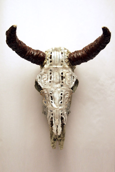
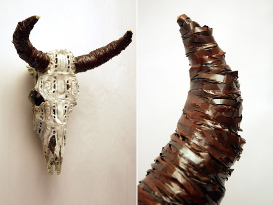
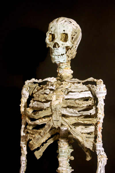
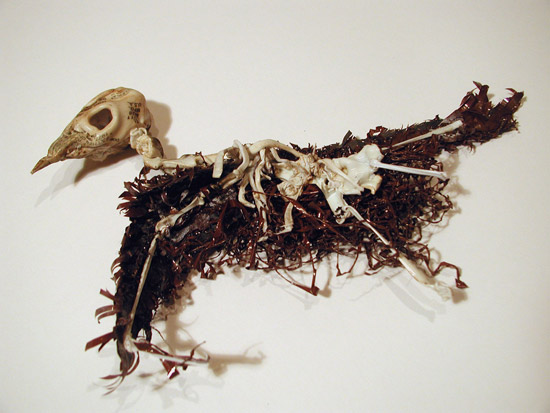
So, I came across this little gem at Designboom and saw they posted a blog I'd like to share. An artist by the name of Brian Dettmer made amazing skeletons from cassette tapes. I know some of are you are wondering what a cassette tape is, but they contained music that you would listen to on a cassette player or a walkman. lol Well they're ancient in this modern age of technology, so it's good to see they are used in some form. Here's some a small bit of text from designboom. "atlanta based artist brian dettmer creates intricate sculptural skeletons using altered cassette tapes.
dettmer began creating the pieces in 2005 as he was thinking about the demise of analog media in
the increasingly digital world."

http://www.briandettmer.com

Designboom Blog


Wednesday, November 11, 2009

VIDEO: Screenprinting Process

This is a very good useful video about screenprinting. It takes you through the whole process of how it works. Some companies have automatic machines, which pretty much takes the printer manually putting the ink on the shirt or what have you out.


Here is another video from Branded Baron http://www.brandedbaron.com This is a quick video of the manual printing for the design "Astrohop"(Available Here)

Tuesday, October 27, 2009

11 Fantastic Photoshop Tutorials Brought to you by Computer Arts

I'm a fan of Computer Arts and they compiled a list of 11 great photoshop tutorials. I definitely recommend checking it out. They have some tutorials that will definitely help your art stand out.


Create awesome ethereal artwork with Photoshop’s Warp tool
Design duo Shotopop show you how to turn plain source images into inspired art the easy way


Make action images more dynamic in Photoshop
With dynamic distortion and a little Photoshop magic, you can introduce speed to your subjects. Doucin Pierre, aka Soemone, shows you how


Add magic to your photos in Photoshop
It doesn’t matter how powerful Photoshop is – great results still depend on the skills of the user. Per Gustafson shares his expert advice for making mediocre photos magical


Create striking portraits from a pencil sketch
Hoang Nguyen explains how to create a simple composition, lay out an interesting background, and define the light source

CLICK HERE TO VIEW THE REST OF THE TUTORIALS

Roughen Up Your Vector Work- From Computer Arts


I saw this at Computer Arts and thought I should post it for those who may have not seen this. This starts from a hand drawn illustration, to illustrator, and finished in Photoshop.

DOWNLOAD PDF TUTORIAL

DOWNLOAD SUPPORT FILES

Thursday, October 15, 2009

Mathiole Interview By DesignByHumans.com


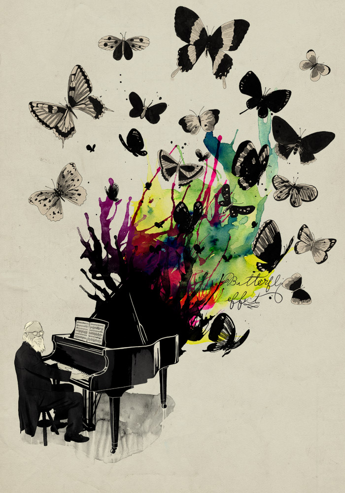
Mathiole(http://www.mathiole.com/website/) is an artist that I enjoy following, because the pieces he come up with are so compelling. They're very vibrant and he knows how to use watercolor to create very interesting and sometimes funny art. He's won many t-shirt design competitions, especially from Design By Humans, which is probably why they interviewed him. He is only a recent college grad, so his work will be interesting to watch mature. He's a one question and answer from the interview:

When I think Mathiole, I think watercolors- in designs like Ecstacy and SeaSick Symphony, you’ve used those huge splashes of color to great effect! How did you start to develop this style? Do you have any tips for other artists who would like to begin experimenting with watercolor?

Well, it was a natural choice. Since I was a kid and started drawing, I hated colored pencils, crayons and pastels. I tried oil-based ink, acrylics, but didn’t like the results. Then, when I started my drawing lessons, I started using Ecoline (like a liquid watercolor), and from that I got better results and became more interested for colors. In college, right from the beginning, I had classes about the theory of color, and it helped me a lot, because although practice is very important, theory helps us see through things.

Using watercolor was a natural choice of my style, from the moment I decided not to do images which were purely digital and started searching for the beauty in imperfection of the handmade drawing.

A lot of people ask me how I do all this watercolor effects. Well, they are not effects, they are made in paper, it is real watercolor, only scan it! We live in a time so digital and technological, and that to me seems do alien some artists. They forget they can use a real brush, instead of a Photoshop filter. So my tip is: practice! And don’t be afraid to experiment. Forget a little about Photoshop and Illustrator and look for real effects. Not only with watercolor, but with everything! Use charcoal, coffee, whatever! Even if those experiments don’t bring an immediate result to the work, with time there will be evolution. You can’t be afraid to make a mistake or be lazy enough to practice.


CONTINUE READING HERE


Wednesday, October 14, 2009

6 Ways on How To Make Friends & Influence Art Directors


This is an interesting article. Mike Davidson created a list to help prospective designers who are curious on how to enter the competitive design industry. Here are the first two he has on his list:


1.Your portfolio is a whole lot more important than your résumé. Whenever I’ve had to fill a design position, I’ve always gotten tons of résumés and ended up going straight to URLs without even looking at the education or other qualifications of the applicant first. There are just so many people in this industry who are “all talk” that I’d rather hire someone whose stuff looks great but maybe hasn’t had a chance to go to a great college or work at a great company yet. The best thing you can do for yourself, résumé-wise, is to put together a nice one or two sheeter and offer it online, complete with sample URLs. That way, you make it very easy for whoever will be evaluating you as a prospective employee.

2.With regards to your portfolio, spend every spare minute of your time on it. Nothing impresses me more than a clean book filled with thoughtful work. It doesn’t matter how big your clients are… only how good your work is. You should create imaginary clients if that allows you to flex your design muscle. I would rather see a beautiful poster for an imaginary band than a lackluster design project for a big company like Boeing. In other words, you will never be judged on the size (or existence!) of your clients — only the quality of your work.


Read the rest here

Thursday, October 8, 2009

MUTO-A Wall Painted Stop Motion Animation

I remember seeing this a couple years ago on the PackFM section of the Qn5 Music messageboard while talking about graffiti. I remember my father who's an emmy award winning video editor that sent me this. I figured why not post it up for those who may not have seen it or haven't seen it for awhile. This video looks like the artist used a ton of paint. It's definitely incredible, because of the work that was put into it. Check it out, it's rather entertaining.

Wednesday, October 7, 2009

Masking & Transparency in Illustrator Video Tutorial

Here is a tutorial that I found over at the Black Axe blog It's a brief overview on how to use these and can be very useful in your work.

Masking & Transparency in Illustrator from The Black Axe on Vimeo.

Tuesday, October 6, 2009

Branded Baron T-shirt "Astrohop" Available Online


Branded Baron released this new shirt and I designed it. I was excited to see it printed up and it looks really hot. I had thought of creating a hip hop astronaut that's style is out of this world for over a year. It seems like astronauts are becoming a trend as late, but I had this idea for awhile. It came to see the light of day not too long ago. It was printed on a light blue shirt that is very soft. It's definitely fashionable, so if you purchase and want it baggy, get it a size up. There's a video of this design being printed on the Branded Baron blog http://www.brandedbaron.com/blog This design was fun to do and I like that I put part of the moon in the helmet. This is definitely a Stunningly Fresh shirt. You can purchase this shirt here http://www.brandedbaron.com/product/astrohop

Check out the rest of the Branded Baron site, I created a bunch of designs for this company. http://www.brandedbaron.com

Use the promo code "deviant" in the coupon box and you'll have 12% off your entire order.

Thursday, October 1, 2009

Jeff Finley Interview on Colorburned.com


I've been a fan of the Cleveland design firm, Go Media for a couple years, since I was back in college. Jeff Finley, one of the owners of Go Media, is someone whose work that I always enjoyed. I even remembered when he was under his freelance moniker Mylkhead and I would look at his site. I enjoyed his illustrations and his designs. He created some crazy typography for various companies, one being Paint the Stars. He released some very well done tutorials on Gomediazine. Here is an interview that is informational and it can help out other designers who are working to reach their goals.

Colorburned.com interview
Go Media's Website.
Jeff Finley's Personal Portfolio Site

Monday, September 28, 2009

Wednesday, September 23, 2009

Listen To Your Heart Featured Today 9/23 on TEECRAZE.Com

TeeCraze.com is a site that features 13 new designs available for purchase everyday. Today my Listen To Your Heart t-shirt design created for Branded Baron is part of that group. It is exciting to be featured on other blogs and websites for your artwork. This design is probably my favorite design I ever created. I've always liked the concept, which I feel is very important in a design. The execution has equally match the concept or better to make it that much better of a creation. I hope to have another shirt design make it on this site again. Thanks to the good people at TeeCraze.

-Joe

Friday, September 18, 2009

Purebuttons.com


Purebuttons.com is a great resource to get a range of promotional products. They do really good work and have a fast turnaround(which is fantastic). As you can see below this one they did for Branded Baron a couple months ago. Not only do they do buttons, they also have packaging for the buttons, magnets, keychains, zipper pulls and mirrors. I would definitely go with them. You can find out the price on their site, because they have their own calculation system. They have templates for their products too. Check it out and go there. You'll love what they provide.

Tuesday, September 15, 2009

DesignByHumans.com Halloweek 3 T-shirt Contest


One of the most popular t-shirt sites, is the design contest DesignByHumans.com I own a couple of really top notch and cool looking shirts from there. It's a great outlet to showcase your skill and hopefully will the cash and dbh credit to their store. They have this special theme halloween contest, to come up with a hot looking t-shirt for Halloween. I will be submitting my piece later this week. So good luck to everyone.


From Designbyhumans.com
Design By Humans
MenWomenVoteForumLoginSignup0 DBH CONTESTSPECIAL CONTESTSENTER CONTEST & SUBMIT ARTWORKRULES & PRIZES

HALLOWEEK 3!
It's that time of year again where creepy crawlies, monsters and ghouls take center stage. Start creating your scariest design because the deadline is just around the corner. Good luck and may the most terrifying designs win!

Submission Deadline: September 20, 2009 (Midnight PDT)

Halloweek 3 Guidelines:
1) All printing techniques allowed, including foil, flock, metallic ink, and glow in the dark ink.

2) Submission deadline: September 20, 2009.

3) 5 winning designs will receive $500 cash and $250 dbh dollars.

Monday, September 14, 2009

Inspiration-Fatoe


Hello,
I know I've been slacking. I've been busy. Working on my t-shirt brand, Branded Baron that launched on my birthday on the 27th of August and working on a bunch of design jobs. Here's an artist that I like to check out and gather some inspiration. Mike Orduna aka Fatoe is creates great work. I recommend checking him out when you get the chance. I like the spray paint and splatter and overall look of his designs. It definitely stands out. You can check the rest of his work out his site http://www.fatoe.com/


Saturday, August 15, 2009

Need help with Color Schemes? Go to Colourlovers.com!


I had a college professor tell me that she loved my color selections. Personally my secret is using a monochromatic scheme. It works best for me and I find it a lot easier than combining colors. Of course I have to a variety of colors for many different projects, so if I get stuck on deciding what compimentary colors work or I can't think of a color, I'd go to this website, Colourlovers.com They have a huge selection of palettes, patterns, colors, and they have their own blog on colors. They'll tell you what the current trends are. It's very helpful.

Friday, August 14, 2009

BrandsOfTheWorld.Com For Finding Company Logos For Your Jobs


Whether you're given terrible artwork or a student that wants to add some finesse for a school project, this site is very useful. http://www.brandsoftheworld.com is great with providing you with vector logos for companies from Coca-cola or Pepsi or other big companies. You never know what will be there, so type it in the search engine and see the images that come up.

Tuesday, August 11, 2009

MY ShirtFight.com submission- "Hothead" Process

Hello,
I have always liked ShirtFight.com. For those that do not know what it is, it is a weekly t-shirt design contest. I posted general rules on how to win a t-shirt contest that was written by the owner of the shirtfight.com, El Presidente a couple weeks ago. I've been meanin
g to do this for a while, but I figured I should submit a design for this week. It may be a little late, but hey I can always win, plus I'd like to be featured on their blog as one of the top 10 heavyweights. If I would like to be in that category, because I'll have more people viewing my portfolio,which could lead to more design jobs. You have to look at the bigger scheme of things. It's not just a competition where you're competing for cash and prints of your design, but exposure where you can land jobs. 
        This week's theme was fire, so I wanted to create something good. I had a couple ideas, but I figured why not name a design "hothead". I thought it would be great to have an old colonial type skull on fire. Here's my process from sketching, to doing the linework, to the coloring, and the final design. I knew that I wanted to keep my colors to a minimum, so I would be using a lot of halftones for lighter shades of the colors I chosen for my palette. 
       If you wish to vote for this design, so it can be printed you can go here http://www.shirtfight.com/vote/entry/hothead/   It's free to sign up and vote. They have some cool shirts for sale. They're now going to do bi-weekly themes instead of every week, which gives a designer a lot more time to work on it. I hope you enjoyed this post.
            -Joe

My Sketch being inked
I'm beginning to lay down my colors.
This is more of a complete illustration, but there are still more details I want to add.
Here you can see the background color I wanted and how it to be used for the shirt.
This is the final design and you can see the boxes above which show how many colors I've used. I wanted a burn feel so I added some grunge effects. Next thing to do is mock it up on the shirt and submit it.


Thursday, August 6, 2009

T-Shirt Magazine's Article "How to Make Money as an Artist"


T-Shirt Magazine is a very useful blog that defines itself as a online magazine then a blog. It has very cool articles and interviews that are interesting to read. This one happened to be an interesting article and some of the items listed on how to make money is possible and others are a bit harder to get done, but can be achieved. Here is a snippet from the article on the ten things you can do to make money as an artist.

"1. Build a Portfolio with the type of work that you wish you were paid to do.

2. Submit Your Work in Art Exhibits

-You will have the opportunity to showcase your work to a large audience and someone might buy your art.

-If the gallery is in a very affluent neighborhood, they’ll pay you big bucks.

3. Enter Art Contests

-You have the chance to rake in some serious cash. Some contests pay winners anywhere from $100-$10,000.

-Even if you don’t win, at least you had the chance to perfect your skill and build your portfolio.

-When you see who the winners are, observe their style and technique. If all of the winners have the same things in common, you should adopt those elements into your own art, so you can win the next contest.

4. Have Your Work Published

-This not only exposes your work to the world, it also builds your credibility. People will think, “If this artist’s work is in a magazine, they must be good!”

5. Build a Website (If you don’t have one, you don’t exist)

-Register your domain name on a site like GoDaddy.

-Display your best artwork.

-Show a list of clients you worked for and include pictures of the work you did for them (Can someone say “Social Proof?”).

-Write tutorials on what you do. This establishes you as an authority in your field."


If you would like to continue reading please CLICK HERE

SKETCHES vol.2

Well here are a couple sketches that I wanted to post the first time around(CLICK HERE TO VIEW), but I felt like waiting. I think I might even try to post a couple new sketches every week. It's always good to see other people's work and if you can draw inspiration then the artist did his job. It doesn't matter whether the inspiration was generated, because of hatred or being a very talented person that makes you want to strive to be if not as good as them, but better. I hope you look forward to viewing my sketches. -Joe Baron


I've always liked this sketch, but don't know what to do with it. I would like to turn it into a t-shirt design.


This sketch was from '07 and it's kind of creepy


I love the female form. I do find it humorous how I added the smileys.


This is a sketch that may turn into a t-shirt design, but I would have to lay out the plans for that idea.


I showed this to my friends and they found it creepy, because that's my face as a drama/comedy mask. It was quick, but maybe I'll find it and work on it adding shading.