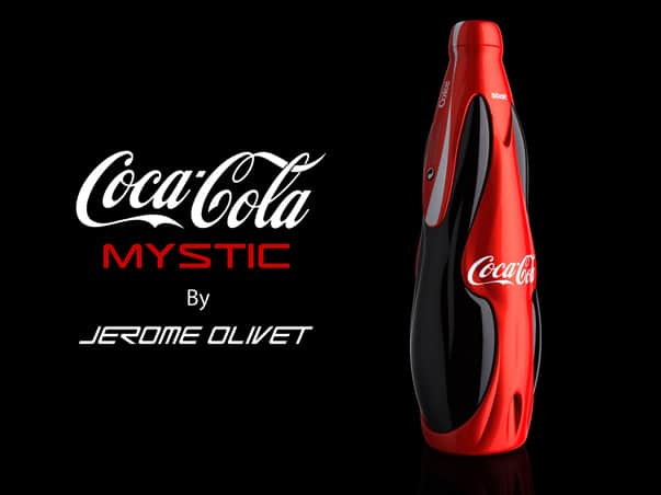
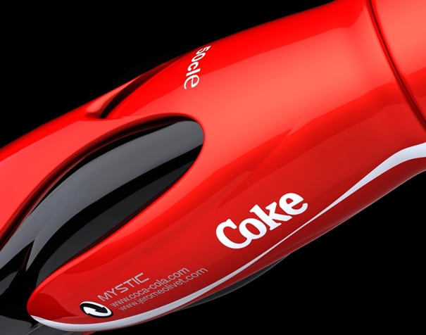
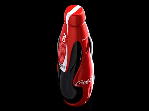
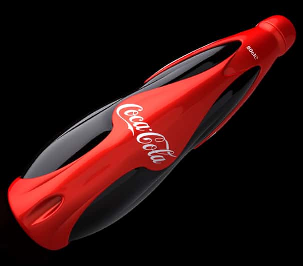
French designer Jerome Olivet offers a new look of what Coca-Cola bottles may look like in the future. The branding of Coca-Cola is absolutely remarkable and their marketing is unquestionable. There's a reason that they are the number 1 soda.
Looking at what Jerome Olivet's design doesn't say timeless or classic. Is it cool looking? Of course and it does include the signature Coca-Cola red. The design itself is nicely done, but does it really fit that classic all time great quality that Coke has? The quality is there, but this is cool for a bit. Sure, some people may want to buy, because the bottle design is creative. Does it really make you want to drink it? Watching the video and what it's trying to promote with "Mystic" is "Sexy", "Supernatural", and "Fascinating"? Like a lot of newer cars today, this design has a sleek look, which supposedly is sexy. The main goal is to have you buy their soda, but over time Coca Cola developed an image that used to market to everyone explaining this is what to expect when you drink Coke. Ok, cool. Brand identity is important and you have to have some niche to separate yourself, but I don't think sexy when I drink soda. I would use "sexy" for a high end alcoholic beverage which caters to clubs and lounges, who have people that are dressed sexy.
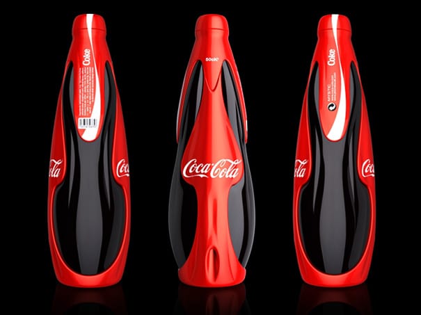
It also looks like some space ship, which is what makes it "supernatural". The design is futuristic and looks like it wants to appeal to a younger generation. It could fit for a sports drink. This type of design would work best for a soda that appeals to a young crowd, maybe like Sprite or Mountain Dew(yes, I know they're owned by Pepsi). Those drinks have branded themselves as the cooler soda, while Coke appeals to everyone and has a taste everyone would love.
The last phrase that was used in the video was "Fascinating" and I do agree that the design does look really good. That would catch your eye, but would you buy on image alone? Jerome Olivet does have talent, because this a good looking package design.
This is what Jerome Olivet had to say about his design,
"
"MYSTIC surprised by its beauty and intensity. It was created to live an intense and fleeting moment. Its racy style describes a supernatural world that soars skyward. Its skin has a sculpted unique spiritual experience.
We discover in the palm of our hand soft and aerodynamic forms. Its living surface is shaped by a force mysterious and transparent. It send us all the energy and excitement of Coca-Cola Its sexy lines and red color give happiness in 3 dimensions.
Both organic shapes intertwine and form a body ambiguous and fascinating. Its loving silhouette, ties into a true popular poetry."
"
I think it is a nice pitch from Jerome Olivet, who had people writing about his design and may have caught some companies attention. I do not feel that it works with Coca-Cola so much, but if they decide to create Coca-Cola Mystic and want to use the phrase of what Olivet think it should represent, they have a winner. You do have to appreciate the real clean look of the product shots and video.
What are your thoughts?