This piece is brought to you by "theinksociety.etsy.com"
Thursday, September 29, 2011
The earth without art
Labels:
365 days of art,
art,
artist,
artist collab,
design poster,
earth day,
gig posters,
gigart,
the earth without art
Tuesday, September 27, 2011
I Am AN Artist - Truth
Labels:
artist,
i am an artist,
no spec,
no-spec,
no-spec.com
Monday, September 26, 2011
Dead Wrestler's Society Exhibition -WWF
There's a new exhibition honoring former wrestlers who have passed. I must say this was cool to see, because I remember when I a used to watch wrestling when I was a young child, even attending a WWF event at Madison Square Garden and enjoying some of the performances by some of the wrestlers depicted. Here's some of the art from this exhibition.
The Dead Wrestlers Society Show opened on 21st September at Aspex Gallery, Gunwharf Quays, Portsmouth - and runs until 30th October.
Double Click to enlarge the images.
Labels:
art exhibit,
dead wrestler's society,
earthquake,
fine arts,
macho man,
mr. perfect,
randy savage,
the hurricane,
the sheik,
wrestling art,
wwe,
wwf
Friday, September 23, 2011
Johnny Cupcakes X Nickelodeon Tomorrow!
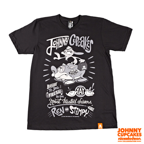
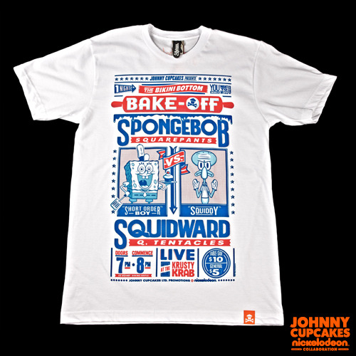
Johnny Cupcakes will be releasing their latest collaboration t-shirts. They released previous t-shirt collaborations with Warner Bros. and Hello, Kitty, but now it's time for Nickelodeon. Johnny Cupcakes puts out a limited amount of t-shirts and they're not reprinted, so if you like them and it brings back memories, I suggest your purchase them. If you can justify the $35.99 price tag that is great. The print is good for the most part, not the best, sometimes they use soft inks, but the shirts are soft. They have a hemtag and a mitten for the tag on the inside, which is smooth and won't scratch the back of your neck.
Check out the video about this project here: http://youtu.be/aNXkQJe8tuk
Expect to see the shirts released online tomorrow http://www.johnnycupcakes.com/.
Labels:
cupcake designs,
john earle,
johnny cupcakes,
nickelodeon,
ren and stimpy,
spongebob squarepants
Lovin IT
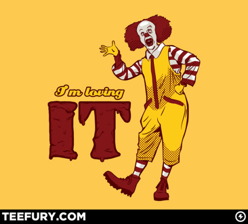
This was apparently sold at Teefury.com yesterday and this image is quite creepy. The combo of a Stephen King horror story mixed with the friendly Ronald McDonald is funny.
Labels:
horror,
horror art,
it,
stephen king,
teefury
Thursday, September 22, 2011
7th Ink Releases Haunted Collection Series 2
3 new designs that are out on t-shirts and hoodies from 7th Ink. There's an nifty laser engraved wooden box set that contains all the shirts, but for $95.00. The best piece out from 7th Ink's latest collection is the "Midnight Owl" which has two different colorways, the blue colorway is limited to 10 pieces. I remember voicing my opinion when Matt asked publicly which of the 4 colorways worked best for this design. I think the outcome is very well done, with the owl being very eery and for lack of a better word haunting. It's by far the best piece with the red or blue colored circular pattern in the background. The design that I am not a fan of at all is "Shakespeare's Wolf". That is released on a navy blue tee and navy blue hoodie. I believe he nailed it with the colors, but the illustration does not strike me as one that should be worn. He made a werewolf and added a skull with the quote from Hamlet to give it a theme, but it's just not horrifying cool.
The tees are $25 while the hoodie is $45 and they come with a limited edition wooden engraved coin. 7th ink prints on American Apparel. Having owned t-shirts from them, the colors are nice and the ink doesn't fade. The downside is that it's a bit heavy and think if they printed with waterbase or discharge inks, it would make it top notch. The personal touch added to the package is great for brand loyalty, but I believe Matt does it with a sincere "thank you" to all those who purchased from his company. So, when you receive that note thanking you and hoping you enjoy that shirt, feel good that he cares about you, the customer. Overall, it's a good release and from a brand that cares on providing you with something awesome to wear.
Labels:
7think,
ghastly ghost,
ghost t-shirt,
haunted collection,
laser engraved,
owl illustration,
owl t-shirts,
seventh ink,
seveth ink fury
Wednesday, September 21, 2011
Things aren't always Black and White
Labels:
#000000,
#ffffff,
adobe photoshop,
black and white art,
design poster,
geek,
web design
Tuesday, September 20, 2011
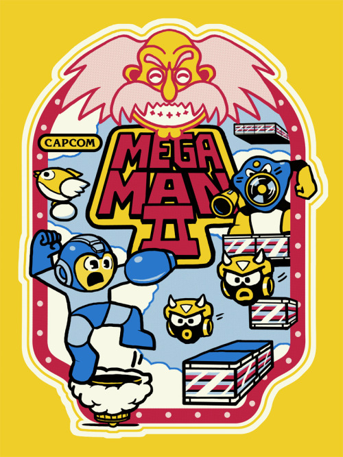
Mega Man 2 Arcade Design by Derek Deal
From Derek Deal about this piece:
Here’s my piece for the Video Game show opening tonight at Gallery 1988 Venice. It’s a tribute to my favorite platform game of all time, Mega Man 2, and is inspired by classic Nintendo arcade panel art of the 80s a la Donkey Kong, Donkey Kong Jr & Popeye. I’ve always been hugely inspired by arcade machine art since i basically grew up in game rooms, and because Mega Man was never in the arcade I decided i wanted to take a crack at creating the panel art as if it had.
Screen prints will be available at the gallery starting tonight Sept 16th - Oct 6th. Thanks to Mama’s Sauce printing for knocking it out of the park for me once again!
18x25 4 color screen prints on 100lb French Lemon Drop paper. Edition of 50
Labels:
arcade art,
art gallery,
derek deal,
donkey kong,
french lemon drop paper,
gallery 1988,
pop art,
popeye,
screen print,
the black axe,
venice,
video game,
video game art
Friday, September 16, 2011
Bill Gates & Steve Jobs Biographical Infographic
Labels:
adobe,
apple,
bill gates,
billionaire,
computers,
ibm,
infographics,
pixar,
steve jobs,
web design,
webdesign
Jay Wise Shoelace Design Process
It's been awhile since I posted a design of mine, so here is the latest creation. Hip Hop artist Jay Wise is a "sneakerhead", he literally has two closet full of sneakers and he wanted his name created in shoelaces. I originally took a pair of shoelaces and tried creating his name with them. I wanted to get the shapes, take a picture, and work on it on the computer. Well, the shoelaces did not go as planned and were quite difficult to form a letter, although I was able to create a mean "O", but there's no "O" in Jay Wise. I decided that sketching would obviously work best, so I sketched it out and finally came up with one I liked.
*Serious inquiries only if you are interested in having me design a sneaker shoelace design
The design was only going to work in script, but I wanted it to be fun and wavy. I felt I was able to achieve that when I worked on it in Illustrator. I like the text by itself, but felt it needed an outline, which I feel is better. Lucky for me, Jay loved them both, so they'll be used in designs for him.
Feel free to comment
Labels:
365 days of art,
365 days of creativity,
design process,
jay wise,
logo design,
shoelace,
shoelace text,
shoelaces,
shoelance font,
sneakerhead,
sneakerheads,
wale
Wednesday, September 14, 2011
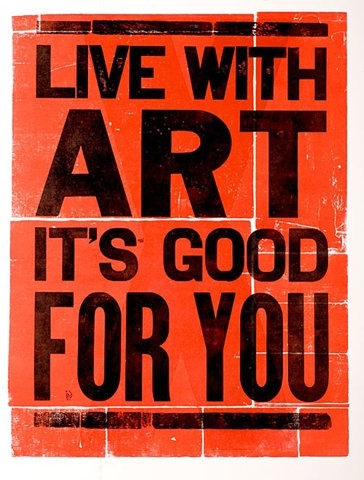
Live With Art, It's Good For YOU
Labels:
365 days of art,
art,
design poster,
graphic design,
live with art,
poster art
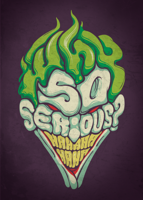
The Joker's "Why So Serious" Typography
The fact that this whole image is made up of letters aside from the eyes, it is incredible. For those unfamiliar, it's a line that the Joker says in the Batman movie "The Dark Knight" Once I came across this image, it had to be shared. Good typographic images are always impressive and Edno Pereira Jr. definitely made an awesome design. View more work here http://jrdragao.deviantart.com/
Labels:
batman,
batman comics,
beautiful typography,
comic books,
custom typography,
dc comics,
deviant art,
Edno Pereira Jr,
the joker,
typography
Color Illustration from Zakhar Krylov
The colors caught by eye and I love it. The concept of the drips forming a face is also a nice touch and you can't if the face is crying due to the drips or is it just closing its eye and having the paint form the face. I appreciate what Zakhar Krylov has done and if you want to see more of his work click here
Thursday, September 8, 2011
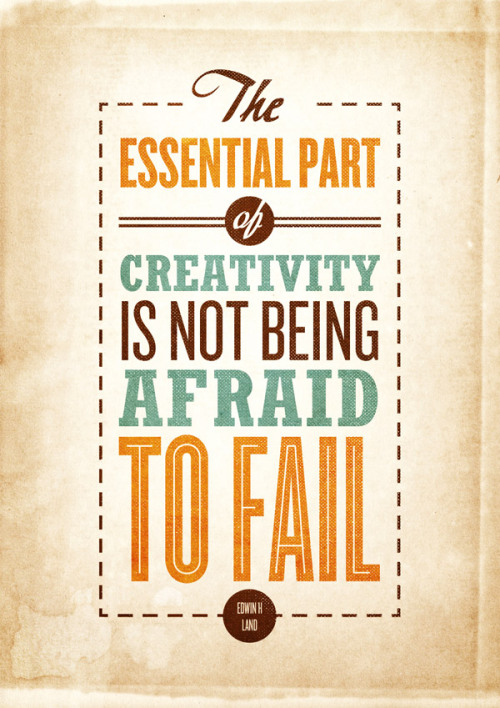
The Essential Part of Creativity...
Labels:
beautiful typography,
creativity,
design poster,
edwin h land,
gig posters,
gigart,
motivation,
typography
Tuesday, September 6, 2011
$10 Ten Buck Tony Sale at Threadless
For 48 hours you can purchase Threadless tees for $10 including some of their hoodies!
http://www.threadless.com
Labels:
$10 shirts,
$10 tees,
branded baron,
designbyhumans,
graphic t-shirts,
threadless
Thursday, September 1, 2011
How to make a car advertisement
Polish graphic designer Wojciech Magierski posted a tutorial on how to create a car advertisement just like the one shown above. This is a very good tutorial and worth reading.
Click here to read tutorial
Click here to read tutorial
Subscribe to:
Posts (Atom)


