Sunday, July 28, 2013
The blog has moved
Hello,
For those following, I have moved the blog format.. You can still look through this blog and get all the goodies here or you can get them all at the new location. I hope you continue to follow.
New blog location- http://joebarondesignblog.com/
Monday, March 25, 2013
Water Changes Ad
Charity Water's is clever and delivers the message clearly. We may take advantage of water, but I'm sure most of us forget about the unsanitary water that other people are forced to use, because there's no clean water available to them. Water helps our lives whether it's the necessary drinking, growing gardens to provide food or having fun painting, it's an essential part of our lives. This ad is another simple and well done design.
Monday, March 18, 2013
Eagle Painting by Hua Tunan
I wanted to share this, because I thought it was a very well done and awesome looking painting created by Hua Tunan.
Labels:
digital painting,
eagle art,
Eagle Painting by Hua Tunan,
eagle paintining,
eagles,
hua tunan,
oil painting,
paintings
Thursday, March 14, 2013
March Madness sale on Branded Baron
Branded Baron March Madness sale is going on. Buy some awesome tees and sweatshirts for a nice discounted price. There are posters, stickers, and buttons for sale if you want some more items.
You can purchase any item at http://www.brandedbaron.com
Labels:
branded baron,
breakaway ink,
designbyhumans,
graphic design,
graphic t-shirts,
karmaloop,
karmaloop kazbah,
march madness,
march madness sale,
threadless
Monday, March 11, 2013
Omunky Farm Series KICKSTARTER Campaign
I met Rick of Omunky this past year after "digitally" knowing him through the internet. He has an animal theme t-shirt line, but it's not your normal animal shirts since they all have a fun and quirky twist. Rick is always out at various craft and street fairs selling his tees and spreading his humorous line to the world. He has decided to up the ante with his new "farm series" by creating a Kickstarter campaign. Your rewards range from buttons, to digital wallpapers, to one of the tees, all of them, and some screen printed posters. Think of them as really good prizes you can get. Help him make these new designs over here.
Labels:
animal graphic design,
animal t-shirts,
clothing line kickstarter,
die cut stickers,
die cut vinyl stickers,
kickstarter,
kickstarter campaign,
omunky,
omunky designs,
rick waters,
screen printed posters
Thursday, March 7, 2013
30 Photoshop secrets to improve your skills
Creative Bloq created a list of 30 photoshop secrets to help improve photoshop. Hey, it never hurts to read and see if there's anything that'll help finish your tasks quicker. Check it out over at Creative Bloq here.
Labels:
30 photoshop secrets,
creative blog,
creative bloq,
improve photoshop,
photoshop secrets,
photoshop tutorial,
tutorial,
tutorials
Wednesday, March 6, 2013
Combine real and digital brushes in this digital arts tutorial
Digital Arts, released a new tutorial on combining real and digital brushes to help improve an illustration. You can view it here. I personally like combining my techniques and it is a good read to see what Adi Gilbert's methods were.
Labels:
Adi gilbert,
digital art,
digital arts,
digital painting tutorial,
inspiration,
motorcycle tutorial,
photoshop tutorial,
traditional illustration tutorial,
traditional painting,
tutorial
Monday, March 4, 2013
DIY Emboss with Greg Mathews
Labels:
diy,
diy tutorial,
emboss,
emboss paper,
emboss print,
emboss tutorial,
greg mathews
Thursday, February 21, 2013
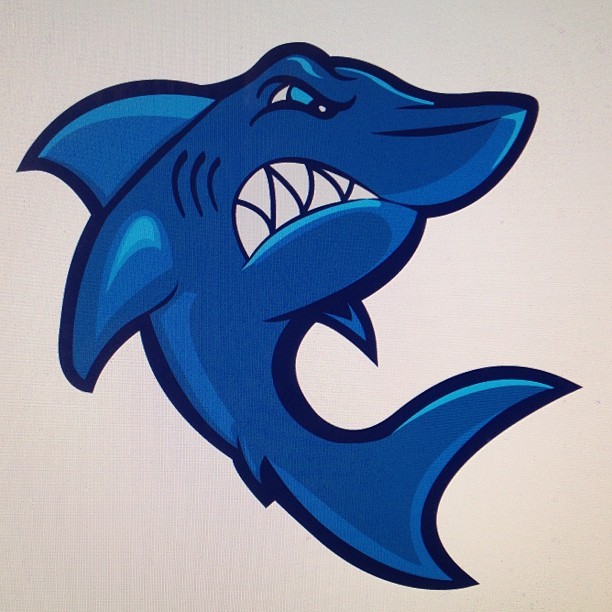
Shark Mascot logo
Here's a shark mascot that I was working on in Illustrator from sketch of mine. One of my goals is to start working on more mascot designs, so here's one step in that direction.
Labels:
joe baron,
joe baron design,
mascot,
mascot logo,
shark,
shark illustration,
shark illustrator,
shark logo,
shark mascot,
the freshnes
Wednesday, February 20, 2013
DOOM scene recreated in photoshop
I don't know how many of you played DOOM back in the day, but I was a fan of the computer game. The fact that a scene was recreated in photoshop is nuts. It is very well done and so awesome. What is just as great is you can watch the progress video of this image being made. Props to you Elemental79.
Labels:
deviant art,
doom,
doom in photoshop,
doom scene recreated,
doom video game,
elemental79,
geekologie,
photoshop,
time lapse video,
video game fan art
Monday, February 18, 2013
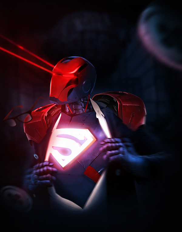
Iron Man/Superman Mashup
This is a creative and well done illustration combining the Man of Steel and Iron Man. There's more mashups by Kode Logic here.
Labels:
iron man,
iron man illustration,
iron man mashup,
man of steel,
superman,
superman illustration,
superman mashup
Wednesday, February 6, 2013
Tattoo artist Dave Tevenal Snake/LanternIllustration Time Lapse
Here's a time lapse video of an illustration done by tattoo artist Dave Tevenal.
Labels:
dave tevenal,
lantern illustration,
snake illustration,
time lapse,
time lapse drawing,
time lapse video
Tuesday, January 29, 2013
20 Useful Photoshop brushes from Creative Beacon
Some great set of photoshop brushes are up for grabs thanks to Creative Beacon for gathering them and posting it.
Download them here
Download them here
Labels:
adobe photoshop,
adobe photoshop brushes,
brush tool,
photoshop brushes,
simen91,
star and light-effect brushes
Monday, January 28, 2013
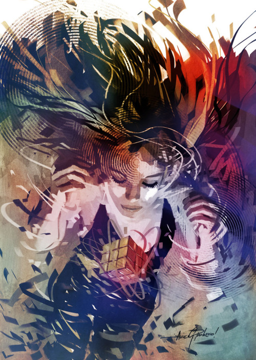
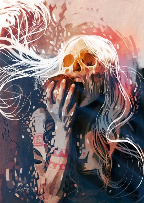
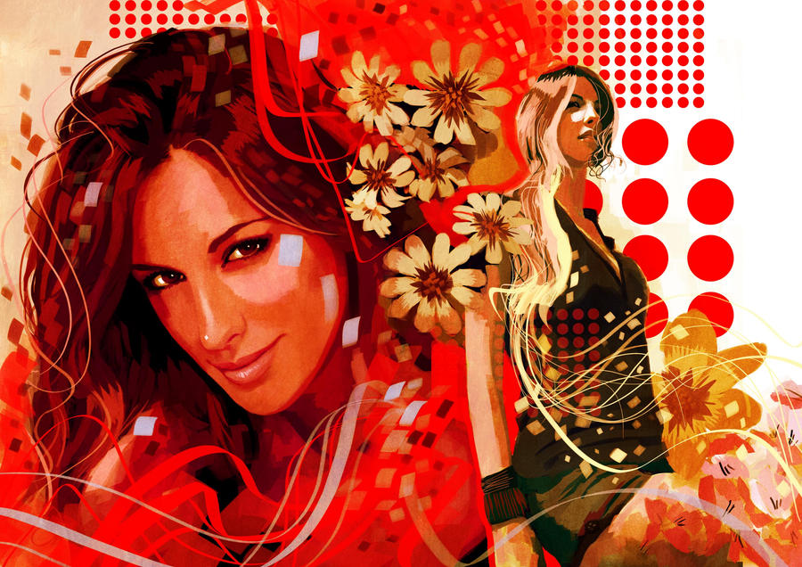
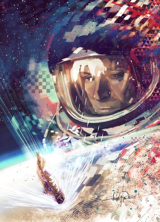
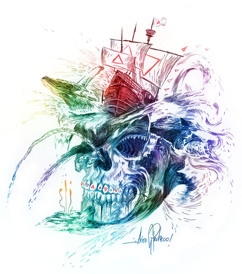
Inspiration Cool Designs by Javier Gonzalez Pacheco
Labels:
deviant art,
digital art,
digital arts,
illustration,
inspiration,
javier gonzalez pacheco,
music design,
photoshop,
skull art,
vector art
Sunday, January 27, 2013
New Orleans Pelicans Logo
The NBA New Orleans Hornets will now be the New Orleans Pelicans when they play their 2013-2014 basketball season. The pelican is Louisiana's state bird, which makes sense why they changed their name. It also has the Fleur de Lys which is another symbol that represents New Orleans. I personally like their new logo and their secondary logos. I feel the colors work well and that overall logo has a classy look and modern style that compliment each other. The pelican itself is okay even though I feel the head and bill isn't that recognizable compared to the wings. I think the angry aggressive look is fitting and shows a fierce bird that many people who are not from Louisiana will consider to be a non threatening mascot when they think of the word "pelican".
What are your thoughts on the logo? Is it simple enough? Does it work well with what the team wants to be portrayed as?
Labels:
basketball designs,
basketball logos,
fleur de lys,
logo design,
louisiana,
louisiana state bird,
nba logo design,
nba logos,
new orleans hornets,
new orleans pelicans,
pelicans,
rebranding
Monday, January 14, 2013
BaseNow "Five-minute posters"
BaseNow developed posters that were done in 5 minutes or less. They are simple with either humorous or inspiring phrases. They are certainly worth taking a look at. View here
Labels:
5 minute posters,
basedesign,
basenow,
design poster,
five minute posters,
graphic design posters,
posters
Monday, January 7, 2013
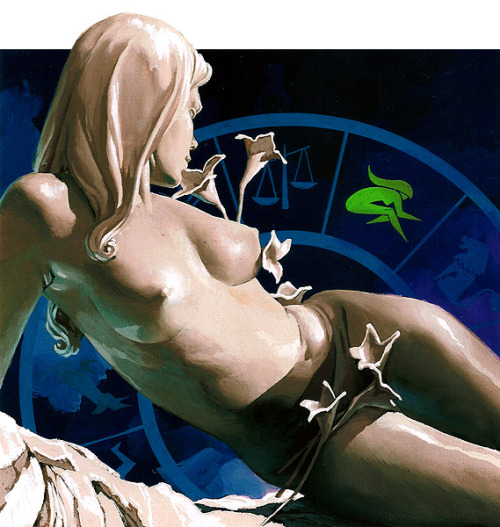
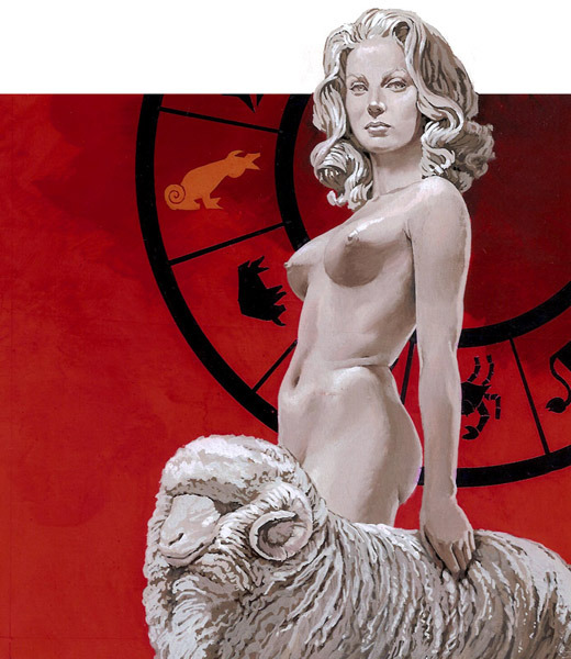
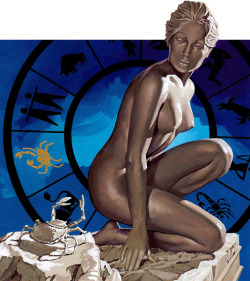
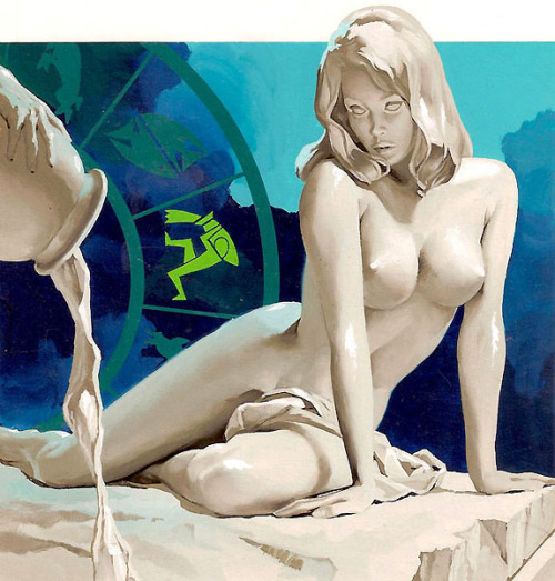
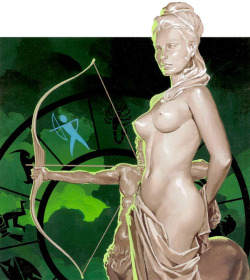
Zodiac signs by José Luiz Benício
Labels:
bralizian illustrators,
brazilian art,
José Luiz Benício,
painting,
zodiac art,
zodiac signs art
Subscribe to:
Comments (Atom)


