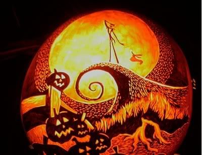
It is Halloween, so here are some cool pumpkin carvings for you!
Sunday, October 31, 2010
Cool Pumpkin Carvings
Labels:
barack obama,
batman,
iron man,
joker,
mars attacks,
nightmare before christmas,
predator,
pumpkin,
pumpkin carving ideas,
pumpkin carvings,
space invaders,
star wars,
statue of liberty
Looking for t-shirts on sale and in your size?
If you're looking for shirt sizes in your size and on sale, check out this site: http://www.mysizecheaptees.com/ This site is great, because it has links to various designs to t-shirt companies that may have too much stock in certain sizes. If you're a XXL wearer and need a new shirt or you're a female looking for a great t-shirt and you're not the typical medium sized shirt wearer look no further. There are sales for all shirt sizes, so check it out. Maybe there's a company that you never heard of that has something amazing or maybe one of your favorite brands that you forgot to check out has a new sale. It's definitely worth looking at.
http://www.mysizecheaptees.com/
Labels:
$10 shirts,
black t-shirts,
cheap tees,
funny t-shirts,
graphic t-shirts,
my size cheap tees,
mysizecheaptees,
sale,
shirt sale
Tuesday, October 26, 2010
Shepard Fairey Wheat Paste 101
Shepard Fairey the man behind Obey, shows his steps of what he does before hitting the streets. He tells you his recommendations, so before you get up maybe there's something you should do first.
Labels:
ecko,
get up,
giant,
graff writers,
graffiti,
obey,
poster art,
shepard fairey,
street art,
wheat paste
Monday, October 25, 2010
HBO's Kenny Powers gives design advice
I saw this and thought it was so funny. It's always funny and very rare to see design humor thrown in once and awhile. Enjoy this small clip.
Labels:
banners,
hbo,
jpg,
kenny powers,
kenny powers design advice,
tiff files
Marvel turns NBA teams into comic covers
This is a very cool, every entire NBA team has been turned into a comic book cover. Some teams are more cleverly done than others, but it is still quite cool to see that the NBA team and Marvel are combined. To view the rest click here. It would be interesting to see Marvel create covers for other sports. I'm curious what the football or baseball teams would look like.
Labels:
celtics,
espn,
espn magazine,
king james,
kobe,
kobe bryant,
lakers,
lebroan james,
marvel and nba,
marvel comics,
nba,
nba logos,
new york knicks,
rockets,
shaq
Friday, October 22, 2010
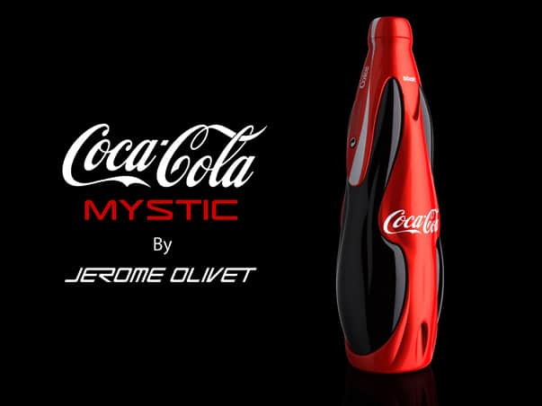
Package Design: Coca-Cola Mystic
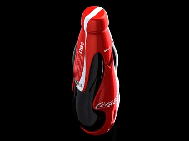
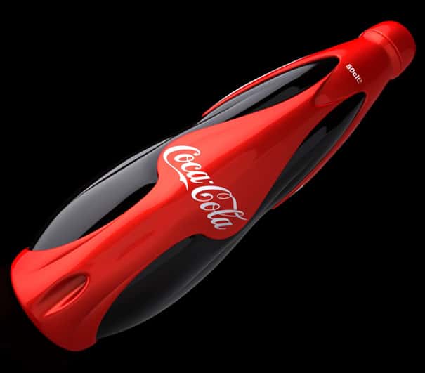
French designer Jerome Olivet offers a new look of what Coca-Cola bottles may look like in the future. The branding of Coca-Cola is absolutely remarkable and their marketing is unquestionable. There's a reason that they are the number 1 soda.
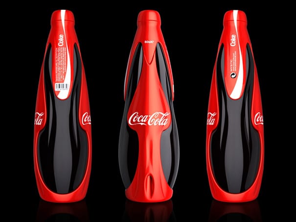
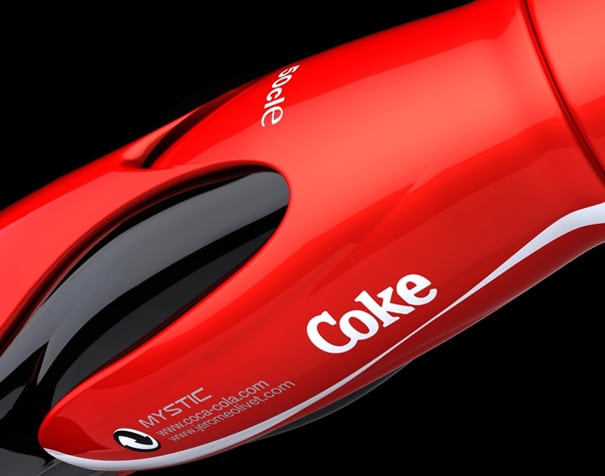
Looking at what Jerome Olivet's design doesn't say timeless or classic. Is it cool looking? Of course and it does include the signature Coca-Cola red. The design itself is nicely done, but does it really fit that classic all time great quality that Coke has? The quality is there, but this is cool for a bit. Sure, some people may want to buy, because the bottle design is creative. Does it really make you want to drink it? Watching the video and what it's trying to promote with "Mystic" is "Sexy", "Supernatural", and "Fascinating"? Like a lot of newer cars today, this design has a sleek look, which supposedly is sexy. The main goal is to have you buy their soda, but over time Coca Cola developed an image that used to market to everyone explaining this is what to expect when you drink Coke. Ok, cool. Brand identity is important and you have to have some niche to separate yourself, but I don't think sexy when I drink soda. I would use "sexy" for a high end alcoholic beverage which caters to clubs and lounges, who have people that are dressed sexy.
It also looks like some space ship, which is what makes it "supernatural". The design is futuristic and looks like it wants to appeal to a younger generation. It could fit for a sports drink. This type of design would work best for a soda that appeals to a young crowd, maybe like Sprite or Mountain Dew(yes, I know they're owned by Pepsi). Those drinks have branded themselves as the cooler soda, while Coke appeals to everyone and has a taste everyone would love.
The last phrase that was used in the video was "Fascinating" and I do agree that the design does look really good. That would catch your eye, but would you buy on image alone? Jerome Olivet does have talent, because this a good looking package design.
This is what Jerome Olivet had to say about his design,
""MYSTIC surprised by its beauty and intensity. It was created to live an intense and fleeting moment. Its racy style describes a supernatural world that soars skyward. Its skin has a sculpted unique spiritual experience.
We discover in the palm of our hand soft and aerodynamic forms. Its living surface is shaped by a force mysterious and transparent. It send us all the energy and excitement of Coca-Cola Its sexy lines and red color give happiness in 3 dimensions.
Both organic shapes intertwine and form a body ambiguous and fascinating. Its loving silhouette, ties into a true popular poetry."
"
What are your thoughts?
Labels:
brand,
branding,
coca-cola,
coca-cola mystic,
coke,
jerome olivet,
marketing,
mountain dew,
mystic,
package design,
pepsi
Thursday, October 21, 2010
Video: Mattgondek draws
Here is another drawing process from Mattgondek(mattgondek.com) If you rememebr the Teenage Mutant Ninja Turtles you may recognize this character.
Labels:
drawing process,
mattgondek,
mattgondek.com,
teenage mutant ninja turtles,
tmnt,
video,
wingnut
Tuesday, October 19, 2010
SHOUT OUT TO ZEROBRIANT
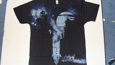
So, I'm a fan of Zerobriant's work as you can tell by some posts I've made. I receive an e-mail from him telling me how grateful he is for the promo I give him and he was so thankful that he had Design By Humans send me a shirt. Now I was planning on picking up the "Never as it seems" shirt, especially since I thought he should have won the DBH 10K contest. I really appreciate the shirt and I was excited when I received it in the mail.
In the photo it looks brighter, but the ink is a bit dull. It's more cool gray than blue. The shirts are always soft the print looks good and it's very to be worn. Part of the design is printed over the seams of the right sleeve and it came out really well. Usually when you print over the seams you see a streak, because it's not a flat surface so there's a little error. Design By Humans always produces good stuff. This shirt is an eye catcher definitely. Thank you Zerobriant.
Labels:
black t-shirts,
dbh 10k,
design by humans,
fishing art,
good graphics,
graphic t-shirts,
lighthouse,
screen print,
screen print textures,
screenprinting,
zerobriant
Design-Graffiti Music
Labels:
branded baron,
graffiti,
music,
music speakers
Thursday, October 14, 2010
Screen printing with human blood!
Now this is cool and very creepy. One of the guys from the Flaming Lips decided to get his blood taken and use his blood to create a print. The print came out pretty cool I must say, but would YOU buy a print that used someone's real blood?
Wednesday, October 13, 2010
Banksy makes mark in Simpsons Opening
Street artist Banksy has made his mark in the opening of the Simpsons by tagging his name all over the town of Springfield, hiding Bart's face as though he was out in the street creating graffiti, and making a dark turn at the end of the opener. The twist you see an Asian sweatshot where the workers create Simpsons merchandise with one worker whipping a Panda bear to move the carriage and another using a unicorn to make dvds. Supposedly this was tightly sealed, until it was aired the other night. It has now become a viral video. Banksy knows how to stir up commotion and all for the sake of art.
Labels:
Banksy,
banksy simpsons,
panda,
street art,
the simpsons,
the simpsons opener,
unicorn
Tuesday, October 12, 2010
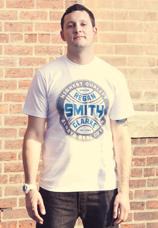
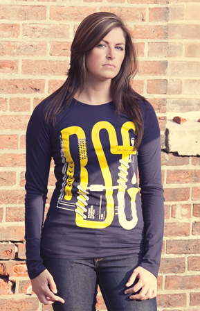
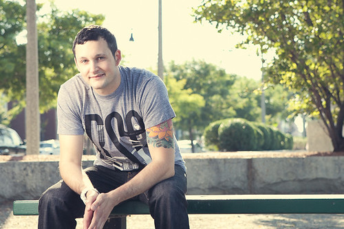
New Regan Smith Clarke Line OUT NOW
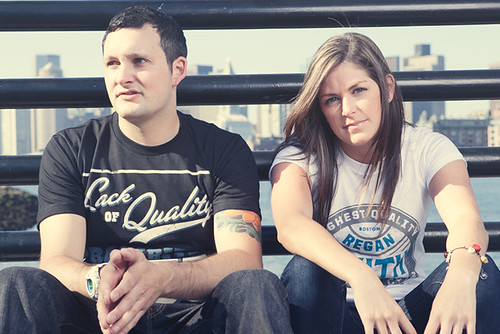
In case you did not know, Regan Smith Clarke has released a new line. There are t-shirts and longsleeves, which focus heavily on clean and simple graphics. I do not mean simple as in crappy designs, but the simplicity gives the design a certain elegance that only leads to positive feedback. Take a look and maybe there will be something you would like to purchase.
My personal favorite, The Highest Quality Seal
On a side note, I've noticed other companies using a seal as well. Maybe this type of design is very effective for business.
Old Inventions Longsleeve It is a unisex shirt.
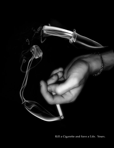
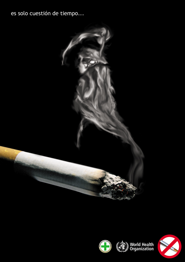
Great Anti Smoking Ads
I came across this site and they had a bunch of ads that were not boring anti-smoking ones. Some of these are pretty damn good. You can see them all here, but here is a preview of what you will see.
Labels:
anti-smoking,
anti-smoking ads,
cigarette ads,
cigarettes,
smoke,
smoking,
stop smoking,
truth,
truth ads
Friday, October 8, 2010
Mr. Cartoon Tattoos NEW YORK
Labels:
mister cartoon,
mr. cartoon,
new york,
new york city,
tattoo,
tattoo artist
Thursday, October 7, 2010
Great Quote-"The Artist..."
"The artist is nothing without the gift, but the gift is nothing without work." - Emile Zola
Paul Cézanne, Paul Alexis reading toEmile Zola, 1869-1870, São Paulo Museum of Art
Labels:
art,
emile zola,
inspiration,
paul alexis,
paul cezanne,
quote,
sao paulo museum of art
How to Approach Art Directors WITHOUT being annoying by Mike Byers
Mike Byers, a Canadian illustrator, writes a couple points for approaching Art Directors without being annoying. Some people may call persistence annoying, but here's 5 bullet points that may help to not be thought of as "annoying."
1. Target Your Audience
The absolute first step you should take is to narrow your contact list to the Art Directors who are actually looking for the type of work that you do. You’ll only be wasting their time, and yours, if you are soliciting clients who have no interest in hiring you.
Examine the work that they’ve done in the past and consider whether your work or approach fits within that scope.
Having some knowledge of an Art Director’s work is obviously a good practice anyways when building your mailing list, but it’s also the best way to make a good first impression.
Labels:
art directors,
canada,
canadian designers,
canadian illustrators,
client,
freelance,
freelance illustrator,
mike byers
Tuesday, October 5, 2010
King Noir - The Story So Far Video
King Noir is a a clothing that is influenced from tattooing, music, and the skateboard culture. Tom and Lawrence, the owners, hand print everything. Here is a video of their story so far. They went with the HBO show feel of "How to make it in America". It's a little too long and watching the video makes me think this brand is more for Brooklyn hipsters than any of the counter cultures they're going for. It's funny that I say that since they're from Britain. The design I do like is their dead doll, which comes in three colors. http://www.kingnoir.com/store/
Labels:
brooklyn,
dead doll,
graphic t-shirts,
great britain,
hipster,
king noir,
music,
screen print,
skateboarding,
tattoo
Never as it seems by Zerobriant now available
This shirt designed by Zerobriant is now available for purchase. I personally thought this was the design that would've won the whole 10k competition, but I'm wrong. I honestly thought this was the best design and competitions like these always never happen as you expect. Pick up this shirt, before it's sold out.
"Never as it seems" buy here
Friday, October 1, 2010
Client Types - This is so true
Labels:
client,
client types,
comic strip,
freelance freedom,
n.c. winters
Subscribe to:
Comments (Atom)


