Saturday, July 31, 2010
Lead & Light -Vibrations T-shirt
I just got this in the mail today and I'm happy with this tee. Designer Sam Kaufman heads the company Lead & Light(http://www.leadandlight.org/). The shirt designs are amazing one color designs that has great detail. The textures he adds to the designs just make it pop even more. I've been a fan of this tee since it came out in the winter or early spring. The tee entitled "Vibrations" is $15 and shipping costs $4, plus I assume the state sales tax(which will vary depending on where you live). The shirts are hand printed, it didn't matter to me but maybe to others it will. The print came out looking good. Check out the shirts, some of the designs aren't so complex. It's printed on American Apparel and it arrived pretty quick. I like it and if you want you can get the zip up hoodie. I'm a fan for sure.
Labels:
all seeing eye,
east fork studios,
hand,
lead and light,
sam kaufman,
vibrations,
vibrations tee
Friday, July 30, 2010
Good design is all about.....
Labels:
design poster,
designers,
good design,
good design is about,
idiots,
posters
Thursday, July 29, 2010
New Portfolio site on the way
Companies rebrand themselves every couple of years and I think to brand myself as a more serious designer(not that I'm saying that I am not, which I am) I should showcase my designs in a more professional site. I liked how my current site is simple and firmly believe that the designs are what's important, I feel there are ways where you can improve on it. It is crucial that any website has to be easy to navigate, but if you can add some flare it doesn't hurt. When it comes to targeting a client, you want to have designs that will jump out and speak to them, so it is important to have the perfect examples for them. Before you can have the client go cocoa for cocoa puffs over your work, the presentation must be there from the start. I believe that when my new portfolio site is up, I will be able to gain more people to view my site(of course marketing is needed) and be able to look and read about all the work I've created.
Labels:
brand,
branding,
brands,
cocoa puffs,
flare designs,
portfolio,
portfolio site,
rebrand
Wednesday, July 28, 2010
King Kong Vs. Bruce Lee
This is a very interesting design that is available exclusively at Ript Apparel for one day for only $10. This is a funny design, that I like. Who will wing King Kong or Bruce Lee? The angles of the two main characters are odd and bothers me. Also it seems that the gorilla referenced is very similar to Mateus Santolouco's image. The concept is funny and if you want to own then you should pick it up, before it is gone. The design is created by Montreal native Sidoneon. You can view more of his art here: http://sidoneon.deviantart.com
Labels:
bruce lee,
canada,
canadian designers,
gorilla,
king kong,
king kong vs bruce lee,
mateus santolouco,
montreal,
ripped art,
ript,
ript apparel
Sunday, July 25, 2010
Thursday, July 22, 2010
Nebulae Grunge Textures
Get these 10 great looking space nebulae space textures over at http://nebulaegrunge.com/ To Download go: http://nebulaegrunge.com/post/82116614/download-zip-if-you-find-the-textures
Labels:
galaxy,
nebula,
nebulae grunge texture,
space,
stock photos,
textures,
universe
Wednesday, July 21, 2010
Branded Baron's 8 at 8 sale
Branded Baron will have an 8 at 8 sale. What that means is at 8pm. eastern there will a couple shirts available for $8. That's one crazy deal. The catch is it will only last for one hour. Pick it up while you can.
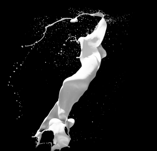
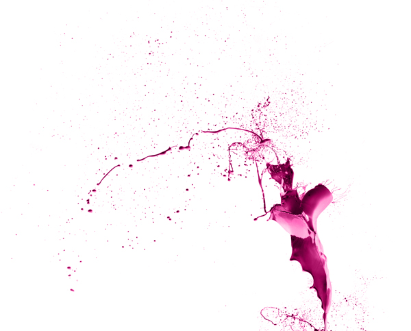
20 Free Paint Tossing Images brought to you by Media Militia
Media Militia has brought you 20 free great splatter images. I love these splatters and have tried to incorporate the images as best as I can in certain designs when needed. I've been influenced from such as art from Laura Alejo where I posted a Nike Ad http://joebarondesign.blogspot.com/2009/02/inspiration-nike-ads-by-laura-alejo.html Now I've seen iStockphoto.com have some, but these are more and free.
You can download the zip file here: 2bnqycekrx.zip Enjoy and thank Media Militia. You can see the rest of the paint splatter preview at http://mediamilitia.com/paint-tossing/
Labels:
free images,
istockphoto,
laura alejo,
media militia,
paint splatter,
paint tossing,
splash,
splatter
Teefury 2010 Collaboration
Hey for today only, you can get a Teefury shirt that has a design that was created by various artists, including yours truly. It's Teefury's anniversary, so another special collab was the way to go. Check it out and buy one. Plus you get free stickers with each purchase. Teefury.com
Here is a close up. Mine is the fifth one down on the first column. It has a lightning bolt.
Labels:
2010 teefury collaboration,
artist collab,
collaboration,
limited edition t-shirt,
t-shirt design,
teefury
Sunday, July 18, 2010
Make your own font w/ YourFonts.com
I came across this about a year ago and forgot about it until recently. This site I've heard isn't bad when you want to make your own fonts. I heard the kerning can be off a bit, but everything is cool. It's a good little way to make your own fonts.
http://www.yourfonts.com/
This is what's on the homepage:
- Your own handwriting turned into your very own font
- Create fonts with more than 200 characters
- Optionally include your signature and digitally sign your contracts
- You'll have your very own font within 15 minutes
- Preview your font for free
- Make as many fonts as you like
- Use your fonts on Windows, Mac OS X and Linux
- Personalize your digital scrapbook pages and invitations
- Make your own "family handwriting history"
- Use your fonts in Microsoft Word, PowerPoint and every program that you own
- Just $9.95 (plus $5.00 if you upload both template pages) - only purchase if you're satisfied!
Labels:
creating fonts,
custom font,
font,
fonts,
handwritten,
yourfonts.com
Saturday, July 17, 2010
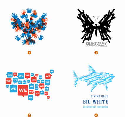
Logo Lounge's Article on 2010 Logo Trends
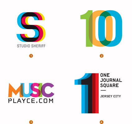
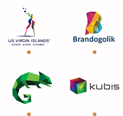
Logo Lounge has an article every year discussing logo trends. Some of them I agree with and see all the time and other's not so much. Designer and Logo Lounge head Bill Gardner discusses details that are now much more important than before. Here is a blurb from his article,
"brightness in hue has become pervasive, likely due to the public’s eye being thoroughly trained now for light-projected, on-screen color. We now live in a RGB, not a CMYK world."
Some of the current trends today in logo identity are Cubists, Shift, & Parts(although I see this in many designs not including logos, but one example is the new Expendables movie). Plenty of circular designs have surfaced, especially when the last Presidential race was happening. I recommend you read the article, maybe you're creating some of these trends already or maybe you might. So if you need some inspiration when you're in a creative block check out this link. http://www.logolounge.com/logotrends/
Labels:
bill gardner,
cmyk,
cubists,
logo design,
logo lounge,
logo trends,
parts,
presidential logo,
shift
Thursday, July 15, 2010
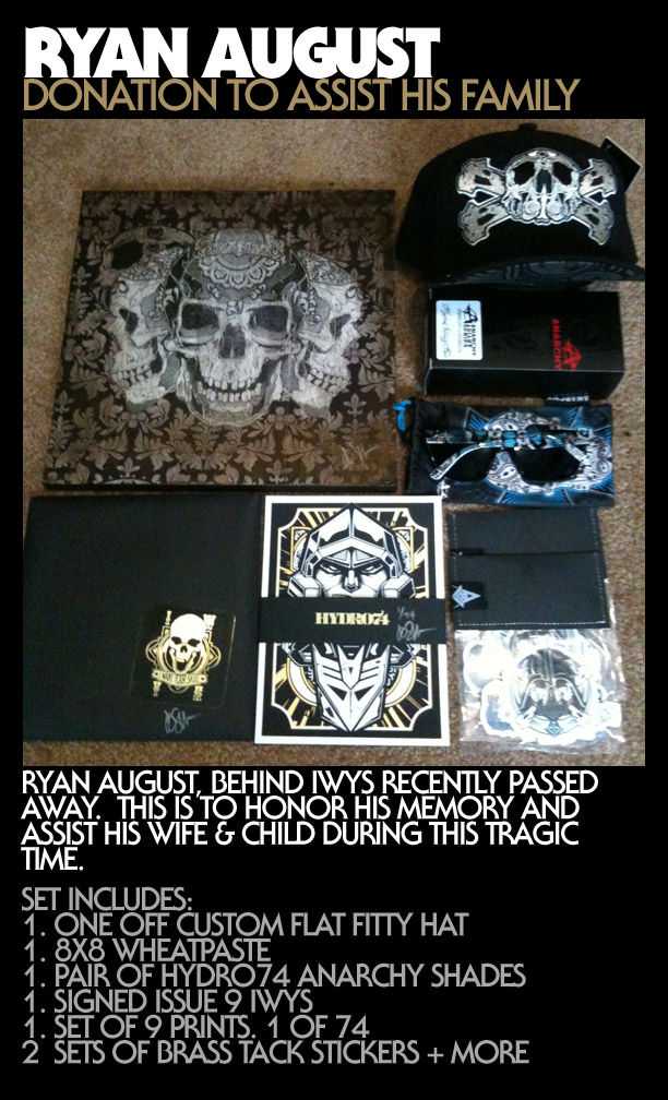
Ryan August of IWantYourSkull-Donation to assist his family from Hydro74
Ryan August owner of the IWantYourSkull.com recently passed away. If you check it out you'll see that he was involved in the art community with his project. I'm sure there may be a possibility to buy some of the limited edition magazines, but right now I am uncertain when they will ship. His wife wrote on the blog that she will continue to honor his commitments when she can. Joshua Smith aka Hydro74 has some prints and attired for auction, which all the proceeds will go towards August's family. He explains his reasoning on a forum on gigposters.com, "My first thought was what if I passed and and what I would have to offer up to my family. I can't say I have much being a full-time freelancer, as we all know it's a struggle to make ends meet from time to time and any savings tends to be eaten by any lingering debts. So i can only imagine that added stress that his wife must feel on top of this tragic event. " You can read it here : http://www.gigposters.com/forums/anything-goes/151285-hydro74-donation-ryan-august-iwys.html and you can read the recent thread about his passing here: http://www.gigposters.com/forums/anything-goes/151257-ryan-august-rip.html If you can bid. If the situation happened to you, what would you like to be done?
9 prints by Hydro74
IWantYouSkull Magazine cover:
Images of the book:
Labels:
hydro74,
hydro74 auction,
i want your skull,
iwantyourskull,
joshua smith,
joshua smith aka hydro74,
ryan august,
ryan august rip
Wednesday, July 14, 2010
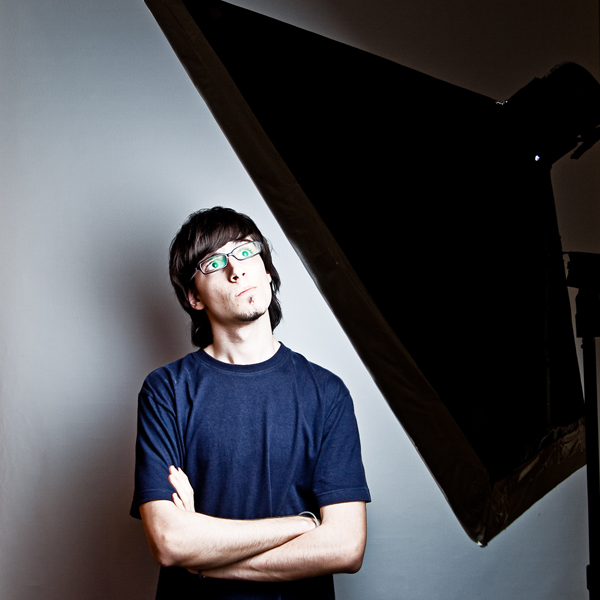
Photographers Make a Professional softobox for under $20
A Softbox is a type of light modifier, used specially in studio or outdoor portraits. It creates a soft diffused light by directing light through some diffusing material. The light is reflected in its inner walls, covered with a bright surface, usually aluminum foil, bouncing against a white diffusion sheet.
It can be used with either strobe light or continuous light sources. The main purpose of a softbox is to create a soft and uniform light, often used as key light. Also, it’s perfect for lighting a studio, where every inch of bright area is important.
Now you can create your own softbox using cardboard, aluminum, and a few other items that won't cost you a pretty penny. Check out this tutorial http://photo.tutsplus.com/tutorials/hardware-tutorials/diy-how-to-make-a-professional-softbox-for-under-20/
Tuesday, July 13, 2010
DesignByHumans Anniversary Sale
DesignByHumans.com is celebrating their 3rd anniversary, so to celebrate they're offering shirts for sale as low as $7. Pick them up before the sale ends.
Thursday, July 8, 2010
Custom Packaging Examples for Indie Clothing Companies
Adam of iamthetrend.com talks different examples for indie clothing companies that wants to enhance their customer's experience.
Labels:
custom packages,
custom packing,
iamthetrend,
iamthetrend.com,
package design,
packaging,
packaging design
Wednesday, July 7, 2010
StandoutStickers.com
StandoutStickers.com is a great sticker place, if you're looking for stickers to be printed. They have a fast turnaround unlike Stickerrobot.com which has about a 4week turnaround and their prices a reasonable for the 7-10 turnaround they offer. They offer free kiss cuts for your custom shaped stickers. For those that do not know what a kiss cut here is my explanation. Say you have custom shape made like a star on a white background, but you only want the star to come off the background, then you'll have the die cut without it fully being a true die cut. They're offering that for free, so I recommend that over the full dic cut sticker. The Branded Baron stickers you see below have the kiss cut. Honestly I recommend using them.
Labels:
astrohop,
boombox,
branded baron,
die cut stickers,
kiss cut,
stand out stickers,
standout stickers,
standoutstickers.com
Design a Product Advertisement w/ Creative Fan
On Design.CreativeFan's website, there is a tutorial on how to create a stunning Adidas advertisement. It is important to create some standout images and if you're looking to add some new works to the portfolio, this can help you move in the right direction. It's certainly a creative ad as you can tell from the original clean image on the right compared to the dripping paint on the left. It's always good to take what's given from tutorials and apply it to your designs. Hopefully this helps you out.
Labels:
adidas,
adidas ads,
ads,
creative fan,
design.creativefan,
product advertisement
Sunday, July 4, 2010
Inspiration: Tyson Mcadoo
The other day I saw the book of Tyson Mcadoo. I was intrigued to see these stylized cartoon femme fatale pinup illustrations. It reminded of an artist I know, Delva Borno. The work uses women as the main focus and even though he does have other non-female work on his site, the appealing illustrations are his women studies. http://www.tysonmcadoo.com/ As I was looking, I kept arguing how the illustrations were created. Was it in Photoshop or Illustrator? Most likely it was both for the entire artwork, but just for the main focus it could be either way. It was something refreshing and even though I've seen images similar, it has been awhile since I've seen them. I would check it out. He has some new work which isn't showcased in his book "The Death of Me" and I recommend you take a look on his site. His "Invisible" set under the Ladies section is very creative to showcase the still sexy illustrations of his favorite subject matter. My favorite design is the one titled "Sailor Jerry". I feel the use of dimensions, textures, illustration, help make this a very eye catching design. I assure you there are plenty of worthy pieces to view.


Labels:
dayna deluxe,
femme fatale,
i kinda want to draw you naked,
invisible,
love struck,
pin ups,
sailor jerry,
sexy women illustrations,
swamp,
tyson mcadoo
Thursday, July 1, 2010
Wrecakge Clothing 45% off with "USA" code
Extreme sports and MMA apparel company Wreckage Clothing is having a 4th of July sale. Get 45% off your entire order with the code "USA". They have shorts and various shirts for sale. The one shown above is available in two other colors as well. Happy Shopping!
Labels:
extreme sports,
mma,
mma gear,
wreckage,
wreckage clothing
Subscribe to:
Posts (Atom)


