Friday, February 26, 2010

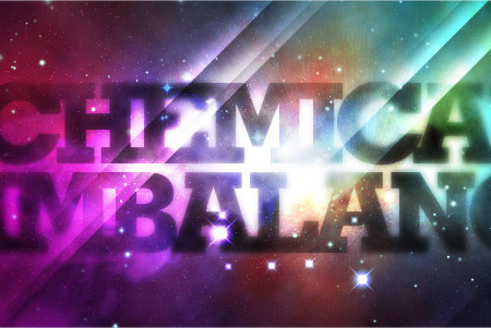
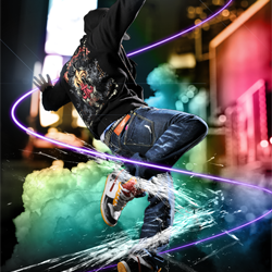
Ventilate Poster Series 3 THEME: 2000

The website Ventilate asked a couple of artists to participate in their third poster series. The theme was 2000 and none of the artists had the Y2k bug stopping them. They asked the artists What inspired you ten years ago? What was it that caused you to strive forward? What enticed you to experiment and push boundaries? The artists that participated were Joshua Smith aka Hydro74, Marco Vinicio, Jois Tai & Rex Advincula, Jason Doherty, Jodi Terwilliger, and Michael & Yuko Brown. All of the posters are free and ready for print at 300dpi. It's great that you can get some cool artwork to have your room, office, etc. and do not have to dig into your pockets for them. It's interesting to see how these artists interpret this theme. I know it's personal, but maybe you would think that they would be very similar. You can download the other poster series as well. Click here to viewPoster Series 3

Jason Doherty


Joshua Smith aka Hydro74

Save Metal Ink Shop Design & Model Contest


Another contest site is calling it quits. It is a shame, because these design contest sites provided such a great outlet for people to have their designs printed and earn some extra cash. With a sea full of design contests sites like Threadless & DesignByHumans it's hard for the other companies to emerge to the elite. Everyone needs some sort of gimmick to be afloat or something that makes them stand out. I like what Metal Ink Shop provided, which was a design contest and a model contest. The target market was geared towards the tattoo crowd, but since it's calling it quits for lack of funding maybe the fad of the tattoo t-shirts are going fading. Ed Hardy & Affliction and all of its clones are on its way out. Maybe since people aren't spending as much the dishing out the $700 cash prize for a design, excluding the award for the model could take a toll on their business plan.
I personally felt Metal Ink provided some cool artwork and introduced some new artists. There model contest was cool too, because it provided upcoming models with a chance to win some money and a free photoshoot. I submitted a design, but it doesn't seem it will be accepted for voting, which is a shame, because I thought it would be cool and fit the demographic. I know I should've submitted it earlier, but I was in talks of a company of selling it, but that didn't pan out. You try to make the best decisions and you learn from them. Either way support Metal Ink by purchasing some shirts and voting on the designs and models.

Here are words from the Metal Ink Shop:
Maiden of the Month & Design Contests
To Be Paused...

Dear Members of Metal Ink,

It is with deep regret that we inform you of a sudden change in events. Due to lack of funding, our Maiden & Design Contests need to be paused until further notice. For now, our last Maiden of the Month contest will be March and our last Design Challenge will be "Everybody Loves Maidens." The winners of these contests will be awarded $300 in store credit only.

We hope that in the near future, we will be able to bring back both contests in full. To that end, we are asking for your support by launching a campaign to SAVE METAL INK!

Here's how you can help:
Purchase Metal Ink apparel. Remember, a percentage of our sales goes right back to the artist who submitted the design.
Introduce your friends to Metal Ink. Using your Personal URL, you can get $3 of store credit for every purchase new members make! Read our FAQs about how to use Personal URLs.

Tell us how you feel by posting on our Forum. We would love to know your thoughts on how we can improve our products and services!

Metal Ink Crew

Thursday, February 25, 2010

Animation: Pivot The Movie

This a very intriguing animation video that a college classmate and fellow graphic designer sent me. The images are very 3D and choppy, but the concept is an interesting one. This video had me wondering if the protagonist will escape the trouble that he came across.
Here is the plot for this movie:
When a man is witness to a murder and takes pictures of the killer, he has to run for his life. During the chase he is able to turn the tables and the prey becomes the hunter. All resulting in an unfortunate ending.

The film is designed and animated by: Kevin Megens, Floris Vos, Arno de Grijs, André Bergs
Music and sound design by Alex Debicki.
Script by Jan Eduards.
Produced by il Luster Productions.
2009

For more info visit: pivotthemovie.com/

Pivot from Pivot on Vimeo.

Monday, February 22, 2010

Watercolor Tutorial-Add another element to your design

Here is a video on creating some watercolor ink washes for your designs. This video will take a step by step on how to create the ink wash and then applying it in Photoshop. I've used this technique and added it to some designs. I even used the ink to create splatters for my arsenal of design tools. After I post this, I'm going to create some watercolor effects. Enjoy!

Saturday, February 20, 2010

DesignByHumans.com "Happy February Sale" Tees starting @ $13


The awesome shirt contest site, DesignByHumans is having a sale that ends on Feb. 22 at midnight. Tees start from $13 and go as high as $17. If you're looking for some really great graphic illustrations on tees, not just a graphic tee, but some great art I recommend that site. If you're an artist, you can submit a design and possibly win some money and your design being printed.

Designbyhumans.com

Thursday, February 18, 2010

Inspiration: Iain Macarthur


British Illustrator Iain Macarthur graduated from Swindon College with a HND illustration degree. His work is very cool, because of how he makes his imagery surreal and his use of creating some interesting patterns. His pen and ink illustrations are great to look at whether you're a fan of looking through artists pieces or looking for some inspiration. I was looking at his "about" page and we share an interest in one artist, Alphonse Mucha. Check his work out at these sites:
http://iainmacarthur.carbonmade.com/
or
http://www.behance.net/iainmac


Wednesday, February 17, 2010

SNOWBOARD GRAPHIC DESIGN CONTEST


That's right ladies & gentlemen, there's a new contest out there brought to you by the good people of Forsnowboarding and Grafik Armor. I hope you're ready to get your design on, because no matter what it's still winter. Spring may be coming around the corner, but until then you may want to create some kick ass snowboard graphics.

Here is info from the Forsnowboarding regarding this contest:
"Forsnowboarding and Grafik Armor are proud to announce their first collaborative project together: Snowboard Graphic Design Contest. Beginning February 15th, 2010, we invite all snowboarders and designers to create their best original snowboard topsheet graphics using our supplied templates and submit them to our official gallery to be judged by a panel of artists, designers and industry professionals. Guest judge for this competition is none other than Mike Orduña AKA Fatoe.

Grand prize is a custom one-of-a-kind Grafik Armor Snowboard Decal Wrap with the winners graphic. Second place gets a Grafik Armor Snowboard Decal of their choice from Grafik Armors current line-up."

As you may already know I featured Fatoe as one of my inspiration posts(Visit blogpost here) It's definitely cool to have a judge who has experience creating some awesome graphics. Good luck everyone.

Here's the link to the contest
http://www.forsnowboarding.com/snowboard-graphic-design-contest/
To view what designs are up in the running.
http://forsnowboarding.posterous.com/

Tuesday, February 16, 2010

Pictures of Hothead Shirt from Ript Apparel


Here are pictures from the design that was up for sale on Ript Apparel The print came out pretty nice. I immediately rocked it, because it came out pretty good. This design was one that I had no idea where it was going to go. I know it's not a great design, but it was cool...excuse me I mean hot. The finishing product on any design usually makes a big difference from when you see it on the screen to in your hands. It looked really good, one thing I did notice is it looks like it's going to crack. At least on one of the two shirts. I hope it doesn't, but it does have a nice soft feel and usually when you print on red shirts, it's a pain for it not to crack. At least that's with white ink, you want to avoid red shirts. I'm not saying it won't look good or come out printed fine, it's just something to be aware of. I do know I added a bunch of distress and halftone distress effects on it. I made the design with the intention of halftones, so it limits the printing cost, but they made all the colors solid. Ript Apparel did an amazing job printing this design. I definitely would like to have another limited edition exclusive design on their site for sale again. They're a good company, so look everyday for an exclusive limited edition design on their site promoting different artists. Thank you Ript Apparel!

Click on the images to enlarge.

Sexy Photo Effect In Photoshop


Here's a tutorial that can create a nice photo for your designs. The tutorial isn't difficult to create, but it can add a wonderful element to your ad or other design that you're working on. Having a perfect lighting effect will enhance a good design to an amazing art piece.


Goddess Photo Effect Click Here

Monday, February 15, 2010

Article Link to 5 Simple Tips for Improving Designer/Client Relationships


Here is a very useful article to continue building a good Designer/Client relationship. Everyone's had their fair share of hellspawn clients and some wonderful clients. Well Aaron Griffith made a short list to explain what can help continue making good relationships stay pleasant. One of them is not to be afraid to say "no" and no one wants to turn down work, but you need to have the time to do it. There are deadlines that need to be met and the human body could take so much work. No need to create an unhappy client by not delivering a design, because you were busy finishing up another's.

To read the full article go here 5 Simple Tips For Improving Designer-Client Relationships

Another HDR Technique Tutorial


I know I provided you guys with links to two HDR tutorials in the past(Click here to view) and here is another one for you. You'll have to use Lightroom & Photoshop, but the effect will come out nice.

Easy HDR Technique by Cristian Iancu

Saturday, February 13, 2010

To Create Modern Art


I thought this was a very interesting image. Agree or Disagree? What are your thoughts?

DOWNLOAD: Wear & Tear AND Paint Textures

316 graphics have some zip files of some textures that you can add to your designs. Download links are listed below.

Textures

Wear & Tear Vol.1
http://web.me.com/philiphepler01/316graphics/freebies_files/316%20Textures%20-burlap.zip


Wear & Tear Vol.2
http://web.me.com/philiphepler01/316graphics/freebies_files/316%20Textures%20-bled.zip


Paint Texture Vol.1
http://web.me.com/philiphepler01/316graphics/freebies_files/316%20Textures%20-roller.zip


Paint Texture Vol.2
http://web.me.com/philiphepler01/316graphics/freebies_files/316%20Textures%20-dry%20brush.zip

Link to Create An Editable Metal Type In Illustrator


Here's a tutorial on creating a metal type treatment in Illustrator. This tutorial claims that you can edit your type after the effect has been made, because you're using the Appearance panel in CS4. Check it out.

CLICKE HERE FOR CREATE AN EDITABLE METAL TYPE TREAMENT

Friday, February 12, 2010

Inspiration-Filipe Aguiar aka ScorpionBlaze


Filipe Aguiar aka ScorpionBlaze is an artist with a graff style, but I like how he blends his marker illustrations with watercolor backgrounds. I came across this artist on Deviant Art, so check some of his pieces out. You can to his deviant art profile page.
http://scorpionblaze.deviantart.com/gallery/


Thursday, February 11, 2010

VIDEO: Stop Motion T-Shirt war

This is a cool video and these guys had to print a bunch of single shirts for this. Check this out.


Stop Motion T-Shirt War - Watch more Funny Videos

Link To Color Theory For Designers


Every designer should know about Color Theory. Whether you're new to design or just want to refresh your memory on some basics here's a nice link to a good article.

http://www.smashingmagazine.com/2010/01/28/color-theory-for-designers-part-1-the-meaning-of-color/

Friday, February 5, 2010

The 30 Best Photoshop Tutorials of 2009


Okay, yes I should've done this back in the beginning of January, but here are some links according to Computer Arts. They believe these are 30 best of 2009 tutorials and I have to say some of them are pretty cool. Check some of the ones I like right away by clicking on these links.
FULL LIST CLICK HERE


CLICK HERE


CLICK HERE


CLICK HERE


CLICK HERE


CLICK HERE