Tuesday, August 31, 2010
Preview of 7th Ink's new shirts-Haunted Collection
Here is a preview of the new shirts coming from 7th Ink. According to owner, Matthew Johnson, there will be hoodies, shirts, belts, and stickers that will be available come Sept. 6th. For those who care, if you are one of the first 10 orders, you'll get a new button pack. I'm amazed people love buttons, but since I don't have any use for them, doesn't mean they aren't great.
My personal favorite from the preview, is the crow design. I think it might have to do with the colors, because it has a cool color scheme. Purple and blue works very well and the white that is there is a small amount. The design is the most well done out of the three and I think it doesn't belong with the other two designs. Style wise the headless horseman and Frankenstein have a similar cartoonish look, while the crow doesn't. This is only series 1, so I'm curious to see what the next series are and if it comes out soon after this release.
To view 7th Ink's shirts go here: http://www.furyshirts.com/
A sample of some of the hoodies & belts:
Labels:
7think,
belts,
blue and purple,
cartoons,
crow,
frankenstein,
fury shirts,
headless horseman,
hoodies,
moon design
Unbranding: The Snooki Strategy
Last week I was reading on Inc.com about "unbranding". If you saw my tweets on Thursday you would know what I'm talking about. One of the most infamous "celebrities" is from MTV's reality show "Jersey Shore", Snooki is being used in a whole new marketing strategy. Since, she's not a great person to represent a company well, due to her time on the trashy reality show and recent arrest stint, she has something that companies like-exposure. She's on television and she was known for always carrying around her Coach bag, until recently. It seems that luxury brands have sent her their bags, so she can be seen on tv promoting their products. Why would anyone want to be like Snooki? No one, but people viewing the show would see the bags and may like what they see. It's this subliminal advertising that will be in the heads of those watching the show, that will have them recognizing the item, talking about it, and most likely want it. It's an interesting strategy and there's no bad public relations, especially when you're on a hit tv show.
To view what Inc.com had to say, view here: http://www.inc.com/staff-blog/the-snooki-strategy.html
Labels:
brand,
branding,
coach,
jersey shore,
luxury brands,
marketing,
PR,
public relations,
snooki,
unbranding
After Effects Basics
I'm starting to get into After Effects and for those interested in learning, but don't know anything here's a good site for basics.
http://www.videocopilot.net/basic/
Inspiration: Eugene Kim
Here are two images that I think are intriguing. I love to see a photo like this with other sports like someone dunking. This is eye catching and you definitely follow the motion.
Labels:
diving,
dunking,
eugene kim,
golf,
photography,
springboard diving
Monday, August 30, 2010
Inspiration: Illustrated Flyers
Not every flyer needs to use photographs. Check out some more illustrated flyers here: http://vector.tutsplus.com/articles/inspiration-30-appealing-illustrated-flyers/
Labels:
appealing flyers,
clean design,
flyers,
illustration flyers,
illustrator,
inspiration,
paint splatter,
vector tuts
Design By Humans Discount
Shout out to ZeroBriant who is the one that gave out these discounts. Use these for your purchase at DesignByHumans.com
Double your discount!!! :)
USE THIS CODES FOR 10% OFF
H45SJU until Sep.1
0CVKTM until September 3
7C1N0R until September 4
VM62QF rock it until September 4
and JLM8W2 until September 7
Labels:
designbyhumans,
designbyhumans.com,
discount,
mma,
mma gear,
september discounts,
splatter,
whale,
zerobriant
Friday, August 27, 2010
Random tattoo-Street Fighter 2
As you can tell from my previouis post, I'm a fan of Street Fighter. I thought this was a cool tattoo. I personally feel tattoos do not get the respect that they should, because you have to be talented to leave someone with a permanent image that looks really good. Yes, there are some not so talented tattoo artists, just like there aren't so talented fine artists and graphic designers. Anyway this brings back some nostalgia of playing the video games. Ryu vs Ken.
Labels:
hadoken,
ken,
ryu,
street fighter 2,
tattoo,
tattoo artist,
video games
Branded Baron is celebrating their 1st year anniversary w/ new shirt, posters, & discount code
Pick up apparel and a poster from Branded Baron. Use the discount code "BONANZA" for a 50% off your entire online purchase. This code expires August 30.
http://www.brandedbaron.com
To purchase go here : http://www.brandedbaron.com/product/sugar-skull
Labels:
50% off,
anniversary,
anniversary sale,
bonanza,
branded baron,
discount code,
poster print,
sugar skull
Wednesday, August 25, 2010
Branded Baron Promo Video for their 1st Year Anniversary
Branded Baron's 1st year anniversary is this Friday and here's a video promoting new items. Also, if you join the mailing list you can get 50% off your next purchase on Friday. Sounds great to me!
Labels:
50% off,
anniversary sale,
branded baron,
discount,
promo video
Monday, August 23, 2010
Waves Crashing on the Scubrella!-Contest Entry
Here is my contest for the DesignByHumans 10K contest. I always had this idea of this scuba diver holding an umbrella and thought it was creatively funny. I added the fish for more of an ocean feel, plus I decided adding crashing waves to the design would give the design something little extra. I have this design on a navy blue, white, and turquoise tee. If you like my design please vote for my design and you can see this shirt printed. I've created three different shirt options for this design.
http://www.designbyhumans.com/vote/detail/78216?page=3
Here is a close up of the design.
Labels:
design by humans,
designbyhumans,
designbyhumans.com,
fish,
ocean,
one color prints,
scuba diver,
scubrella,
umbrella,
waves crashing
Sunday, August 22, 2010
Iconic Poster Tutorial
Video Tutorial: Iconic Poster design in Illustrator and Photoshop from Go Media on Vimeo.
Check out this video tutorial from Cleveland design firm Go Media. The video shows how to use their vectors to create a stunning poster. If you join their facebook group page they'll offer you 20% off discount for your next purchase of their arsenal, which includes a wacom tutorial, vector, textures, various templates, and more. Here is the link to their Arsenal for designers. http://arsenal.gomedia.us/vector-set-18-complete-vector-set.html
Labels:
arsenal,
design weaponry,
fbarsenalfans,
go media,
iconic poster tutorial,
jeff finley,
poster design,
posters,
tutorials,
vimeo
Make your corporate work cool
Here's an article by Simeon Elson who walks through an example on how you can add a little spice to your designs. It's easy to be conservative with the corporate designs, but you can create subtle details to give it flare. Check it out and maybe you can be incorporate into your next project.
Click here to download the tutorial for free
Labels:
adobe photoshop,
business tips,
computer arts,
corporate,
corporate design,
illustration tutorial,
illustrator,
simeon elson
Legacy Of Letters by Luca Barcellona
Labels:
calligraphy,
font,
legacy of letters,
Luca Barcellona
Saturday, August 21, 2010
Inspiration: Coffee Websites
I know what some of you are thinking, there's coffee outside of Starbucks? Yes, there is and I'm sure other companies don't charge an arm and a leg for it either. Smashing Magazine has compiled a list of some good looking coffee websites. Coffee may not be the most exciting subject to design for or maybe it is to some, but if you're in a creative slump on a project take a look at these sites. To view go here: http://www.smashingmagazine.com/2010/08/10/showcase-of-delicious-coffee-websites/
Labels:
coffee,
coffee websites,
corporate design,
inspiration,
smashing magazine,
starbucks,
websites
Friday, August 20, 2010
Live Drawing Video by Heather Sougwen Chung
Labels:
artist,
heather sougwen chung,
live drawing,
live event art,
vimeo,
wall drawing,
youtube
OBAMA Doesn't Realize I Need A Missile Launcher To Protect My Family- Tea Party T-shirts
Regardless whether you're a democrat or republican, the sayings are funny. Obviously it makes the Republicans of the Tea Party movement look stupid, but not all Republicans think like that...at least I don't think so. Politics will always be politics and never played fair. Anyway, that's it on my thoughts on politics, because I'm not here to discuss my views nor do I want to. These shirts are funny and I'm sure you can tell which one is my favorite.
If you would like one of these humorous shirts go to http://imvotingteaparty.com/
If you would like one of these humorous shirts go to http://imvotingteaparty.com/
Labels:
arizona,
barack obama,
canada,
democrats,
funny t-shirts,
homeless,
immigrants,
jesus,
muslims,
nuke,
obama,
politics,
sarah palin,
tea party,
tea party movement,
tea party t-shirts
Thursday, August 19, 2010
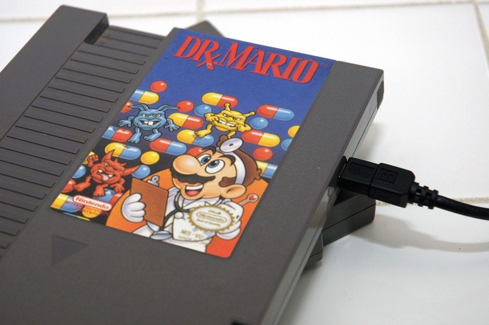
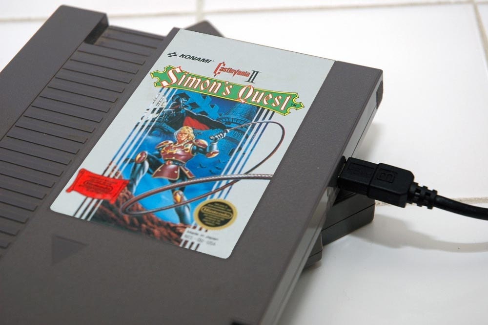
NES Games Hard drives available for purchase
Nintendo will never go away and if you miss the video games, pick up these hard drives at etsy. There's only a couple, but it definitely brings back memories of playing Super Mario Bros., Duck hunt, and Dr. Mario. I really do want one and I have to thank the good people at 8-Bit Memory for coming up with this.
To buy go here: http://www.etsy.com/shop/8BitMemory?section_id=6678855
Labels:
8-bit,
8-bit memory,
castlevania,
castlevania 2,
dr. mario,
duck hunt,
geek,
hard drive,
nintendo,
simon's quest,
super mario bros.
Chun-li and Ryu paintings by Rodney Fuentebella
As I was looking up info about the new Nike Dunks Street Fighter series, I came across these images. These are very interesting watercolor paintings that definitely captured by eye. I like that the figures are more abstract and does not show the anatomical details. I like the warm colors used in the Ryu painting. I do like the composition of Chun-Li better and the splatter in the background. I like them, but what do you think about the work painted by Rodney Fuentebella?
Labels:
capcom,
chun li,
nike,
nike dunks,
painting,
ryu,
street fighter,
street fighter 2,
street fighter 4,
street fighter series,
super street fighter iv,
watercolor paintings
Wednesday, August 18, 2010
Managing Your Personal Brand Online
While putting your best foot forward in the real world is still a great thing to keep in practice, your online persona needs to be managed with the same kind of care and due diligence. This article by Georgiana Cohen is chock full of tips to make sure you’re as well-groomed online as you are offline.
Click here to read: http://workawesome.com/career/personal-brand/
Labels:
brand,
branding,
business lecture,
business tips,
freelance,
freelance work,
georgiana cohen,
logos,
marketing,
personal brand,
workawesome.com
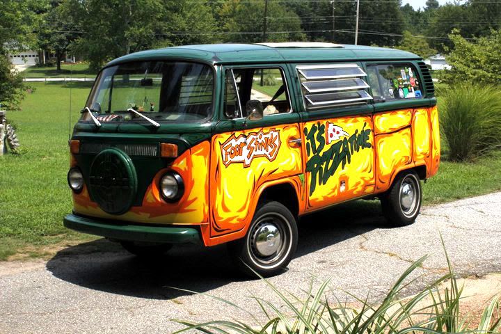
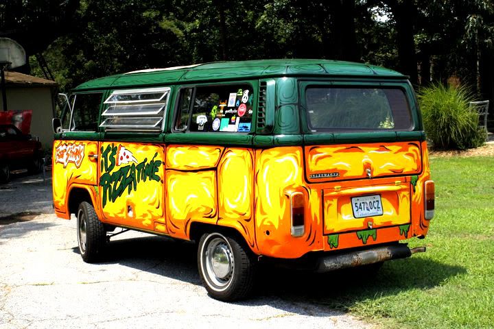
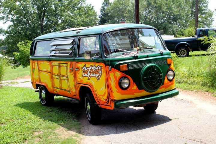
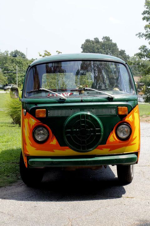
TMNT Bus!
Being a Ninja Turtles fan, seeing this was very cool. This is used to deliver Dominos pizza in South Carolina. This is a great a eye catcher and very cool that this is used to deliver pizza. This was done by Adil Muschelewicz who goes by the moniker IAMSCUMBAG. He did a great job with his version of the TMNT bus.
Labels:
dominos,
dominos pizza,
iamscumbag,
ninja turtles,
ninja turtles bus,
pizza delivery,
tmnt
Tuesday, August 17, 2010
Graffiti Mural in Montreal
If you've noticed the lack of posts it is because I went to Montreal. It's a very fun and clean city and I would like to go there again. I was surprised to see that there's a lot of graffiti just out in the open. When in New York or New Jersey, it is as though you have to search for the pieces and you can spot regular bombs here and there. There is talent and here is a sample of what I saw. I will post a couple more in another post later.
Labels:
bombing,
graffiti,
graffiti art,
graffiti mural,
graffiti pieces,
montreal graffiti,
true colors,
wildstyle
"Scott Pilgrim vs. The World" is very entertaining
Scott Pilgrim Vs. The World is a very entertaining movie and if you have time to go see it, I recommend it. It has the nostalgia for all the people growing up on the old video games. The soundtrack is pretty good and adds to the visual effects which I found to be quite stunning. Michael Cera is actually a bit perkier than he usually is, but that's because the character in the comic is not like the roles he usually plays. Every actor did a good job with their roles. I will admit in the beginning it was kind of off the wall with editing being so choppy, but it ended up flowing. I haven't read the original comics and I know that the endings are different, but I don't think it would really matter. From what I hear it doesn't really butcher the comic, so that's a plus for you who are fans of the original. If you have free time and want some humor with cool visuals, plus fight scenes, I recommend watching this.
Labels:
guitar battle,
michael cera,
scott pilgrim,
scott pilgrim vs. the world,
stars,
stunning visual effects,
visual effects
Wednesday, August 11, 2010
Work In Progress-Sugar Skull Woman
If you saw my twitter feed on Tuesday, you would know that I'm concentrating on a sugar skull influenced design. Sugar skulls are very intricate detailed pieces of art and has gain a lot of popularity through tattoos. It comes from the Mexican holiday the "Day of the Dead." It's always interesting to see how the sugar skull style is implemented on a pretty woman. I decided that I would like to take a stab at it and I personally feel so far so good. There is plenty of work to do be done, but here is the progress so far.
Monday, August 9, 2010
Inking/Coloring video of hip hop illustration
Here's a video of an artist inking and coloring this illustration. You get to listen to Immortal Technique while watching.
Labels:
coloring,
crack pixels,
hip hop illustration,
immortal technique,
inking,
rhyme riot,
underground hip hop,
video
Quick design sketch of a woman's face
Here's a quick drawing I did earlier. It's a drawing that I decided to add some watercolor texture to. Originally it was done in marker, but I decided last minute that I think adding some texture would make it pop. I wanted to keep the details very simple.
Labels:
cool design,
drawing,
face,
simple drawing,
sketch,
sketches,
watercolor,
woman's face
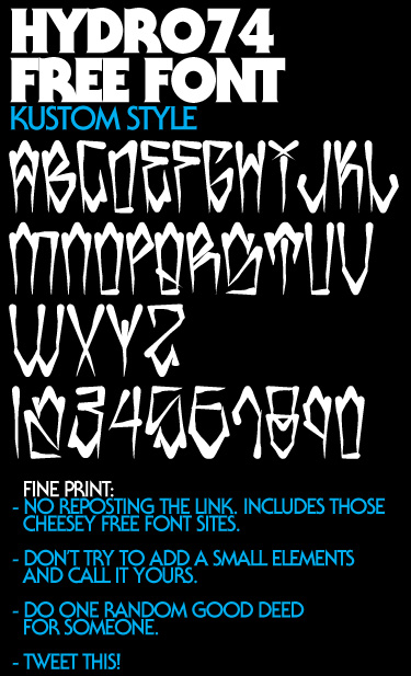
Free Font at Hydro74.com UPDATE: NO LONGER FREE
UPDATE: This Font is no longer free. Please view Legacyofdefeat.com to purchase
Joshua Smith posted a font to download for free. Here is what he had to say about this font and the reasoning why he's making it free :
"When I got back recently from LA I wanted to work on a really raw street tag font with a slight greaser vibe. Nothing over the top, but just to get started in creating some new typefaces. Use and abuse this one. Pretty much a free resource. If you dig this font, check out my others at my store. There are a bunch of cheap ones and some really nice scripts there too.
Just so you know. I really appreciate a majority of designers out there. Also I know that things have been rough with design lately due to economic shifts and layoffs. This is my way of showing the community that I love a little support. This typeface isn’t for everyone, I know, but it could help on something and maybe help add that edge to a piece that you can invoice for. It’s not much, but just my way of giving back!"
To Download go here: http://www.hydro74.com/2010/08/new-free-font-kustom-style/
Labels:
font,
fonts,
free fonts,
hydro74,
joshua smith,
joshua smith aka hydro74
Sunday, August 8, 2010
Kno of the Cunninlynguists album cover art by DIego Fernandez
The Cunninlynguists have used various illustrators for the art for their albums. The producer Kno continues to keep the art alive with his solo project "Death Is Silent". Diego Fernandez is the Argentinian artist who created this cover. The well illustrated face of the woman is complete with the simple background that is her hair. Diego uses the negative space for some of his other pieces of work. This cover fits with the title of the album and think it is powerful. To view music by Kno and his group the Cunninlynguists visit Qn5.com To check out more work by Diego Fernandez visit DeviantArt page.
Labels:
album art,
argentine art,
cd art,
cunninlynguists,
death is silent,
diego fernandez,
kno,
negative space,
qn5 music,
qn5.com
Friday, August 6, 2010
Army Of The Pharaohs-Ritual Of battle CD Cover Art
I've always liked this cover art and feel it's quite creative. Army of the Pharoahs is a hardcore underground hip hop group that was put together by Jedi Mind Tricks frontman Vinnie Paz. They always stuck with an Egyptian theme and I liked how for this album theyy did not use a tomb of a pharoaoh, but incorporated a skull. I like how it has that old grainy feel and how the microphones as a violent scepter. I think the font choice was a good selection. The placement of the album title "Ritual of Battle" was a good choice, because you had the warriors at the bottom preparing their ritual before battles. I like it and feel this is a very creative design worth looking at, possibly used for inspiration.
Labels:
album art,
ancient egypt,
aotp,
army of the pharaohs,
cd,
cd art,
cover art,
jedi mind tricks,
pharaoh,
ritual of battle,
underground hip hop,
vinnie paz
Monday, August 2, 2010
Free Shipping for the first week of August from Branded Baron!
Head over to BrandedBaron.com and pick up some shirt or a couple. There are various shirts on sale too, so it makes the free shipping well worth it. The shirts are absolutely great. If you're a Leo what a way to represent than with the classic Lion King t-shirt. Even if you're not a leo it's still a classy design. Pick up the Red Astrohop t-shirt which has a very solid design. Ladies, there are tanks for sale too. There's a bunch of great designs for sure.
Labels:
branded baron,
free shipping,
graphic t-shirts,
sale
Sunday, August 1, 2010
SHARK WEEK SALE @ 7think
http://www.furyshirts.com
They have the shark t-shirt and it's comfortable with a funny graphic. It's perfect for shark week.
Labels:
7think,
fury shirts,
great white sharks,
jaws,
shark t-shirts,
shark week
The DBH 10K 2010
Designbyhumans.com is having their 3rd annual DBH 10K contest. You get to have a chance to win $10,000. Yes, that prize is $10,000. The competition is filled with amazing talent, so it may be difficult it's definitely worth a shot. From of the designs that are in the top 10 some deserved to be there, while others I disagreed with the DBH staff. I'm definitely competing this year. Who knows what will be the outcome.
http://www.designbyhumans.com/special_contest/details/25
Details:
Submissions are now being accepted through August 22, 2010 (Midnight PDT). All contest submissions must be entered through our online submission form and must conform to the DBH Contest Terms and Conditions in order to qualify for entry. Artists may enter multiple submissions. Late submissions will not be accepted.
- Grand Prize:
- $10,000 USD
- First Runner-Up:
- $1,000 USD
- Second Runner-Up:
- $1,000 USD
- Third Runner-Up:
- $1,000 USD
- Fourth Runner-Up:
- $1,000 USD
Design Guidelines
In addition to our general rules and guidelines, designs are also subject to the following:
- The design(s) must be an original work created and owned by the entrant. Designs may contain up to 14 colors, including halftones and gradients.
- If your design is selected you will be required to submit the winning design in high-resolution (at least 300dpi at actual size).
Submissions Deadline: Aughust 22, 2010 Midnight (PDT)
Labels:
10k contest,
collision theory,
dbh 10k,
designbyhumans,
designbyhumans.com,
jimiyo,
shirt contest,
t-shirt contest
Subscribe to:
Comments (Atom)


