Thursday, March 31, 2011

Jewelry for Graphic Designers


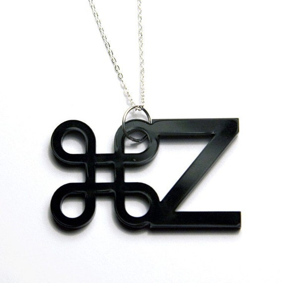
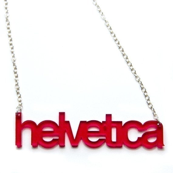
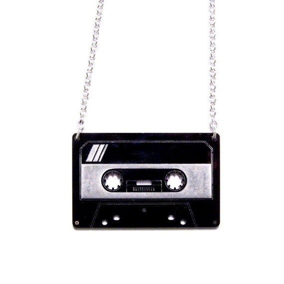
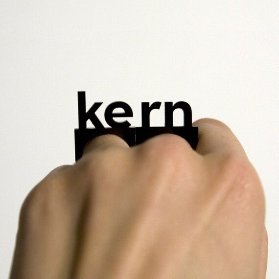
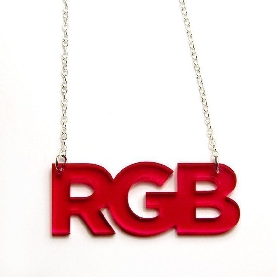
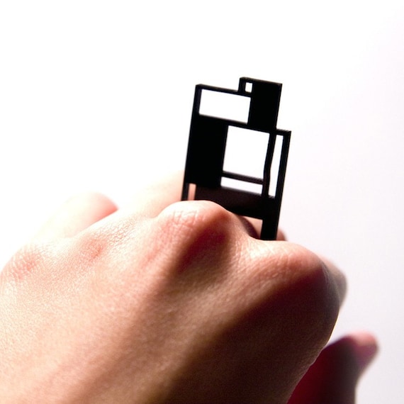
A friend of mine shared this with me and I thought this was pretty great. It's okay to get your geek on sometimes and I think wearing jewelry that says "helvetica" or "rgb" would let your fellow colleagues know you're a fan of graphic design. On etsy there is a stored called "Plastique" which as stated on their website, "plastic jewelry with a graphic designer's touch." I think there are some great pieces like the "kern" rings and the "command z" necklace. The "command z" necklace is probably my favorite and I know everyone always wanted to have that ability to undo a situation in real life like when you're on the computer. That is is $19 and most of the jewelry are reasonably priced. You're a graphic designer and express it even further to the world by wearing what you do.

Click here to visit the Etsy store


Mike Giant mini documentary

Here is a mini documentary about artist Mike Giant. Mike Giant is a graffiti writer, a tattoo artist, an illustrator, plain and simple an artist. His work is consists of a lot black and white illustrations and you can see a lot of his illustrations in the clothing line Rebel 8. The cool thing about those graphics, is that they're all hand drawn and scanned to be printed on the t-shirts. Those designs are not changed into vector format, so what is printed is the authentic drawing that Mike Giant made.


Neighbors: Mike Giant (Full Length) from Agency Charlie on Vimeo.

Toasty at Teefury.com by Winter Artwork

Sucker Punch review


Sucker Punch was a movie that I was excited in seeing. I posted earlier that Alex Pardee was the art director for this film. At first glance it looked like it was going to be great visual effects, action, music, and attractive women, which questioned you about the story. I was hoping that the movie would have been successful in telling a story about these fantasy worlds, but no there was no substance.

Zack Snyder, director of 300 and The Watchmen, had this idea of creating movie where a girl is forced to dance and she escapes into this fantasy world. Ok, so the main character does that after dealing with dramatic experiences in her life like the death of her mother and sister and being forced to go to an insane asylum. The action sequences and visual effects are on point. The backbone for that is the music, which I feel did add to the atmosphere. I think the landscape, the wardrobe and everything else made it eye candy. When "Babydoll" enters this surreal world, it grabs your attention. Although at times it may seem too chaotic, but if you played video games like Call of Duty then you will not have a problem.

Unfortunately this movie lacks a storyline with substance. The story just jumps into the second world immediately throwing you off and questioning what happened to the beginning. You can assume what the ending will be like, but hope there's some sort of clear explanation. The acting is fine, nothing groundbreaking and it doesn't need to be for this film, since that is clearly what it is not about. The story is supposed to be about how this girl deals with these rough situations by escaping into her imagination. You see that, but it just was not well done.

This is a movie is pretty much a sequence of music videos that display action and good looking girls that are ideal for the teenage boy, but it lacks the substance of a good story. I knew I was going to see action, but that tiny hope of an actual story didn't come into play. If you want to see graphics, scenery, action, and girls go for it and you'll probably enjoy that for the 2 hours that you're in the movie theater, but don't expect anything more.

365 Days of Creativity -Day 81-85

If you've been following this blog for some time, you would notice that I have a goal I call "365 days of creativity". I want to try and stay fresh whether it's sketching or creating full designs. I feel it's always good to see an idea of how other people work or sketches to help bring some inspiration on your own work. Lately, I wasn't able to post, so I'll be posting my daily project every week. I will say that it is not always easy to stay creative or be on top of this, because life can be so busy. I'm trying and trying to stay on top of it with new ideas.

As always, click on the picture to enlarge.
Day 81-
Day 82 & 83
I have had this idea to have a diver diving into a galaxy in space, but I'm still trying to get the execution to come out right. Here is the picture I used, before I started to manipulate it followed by the execution.


Day 84- 

Day 85- Photography isn't as easy as you may think.


Wednesday, March 30, 2011

Lebron Illustration by Moto


I may not be a fan of Lebron, no I am not a disgruntled Cavaliers fan, but this illustration is really good. This was done by graphic designer Moto aka Motohiro NEZU . It's a very interesting vector style pop art piece. The colors adds a vintage look to this portrait. You attention goes to his face, followed by the images of him playing, and the lines help maneuver your eyes. I think this an eye catching piece, but what do you think?

Close up

Friday, March 25, 2011

Alex Pardee Suckerpunch Posters


Alex Pardee was brought in to help director Zack Synder come up with visuals for the characters and landscapes for his latest movie "Suckerpunch". Here are some posters that he illustrated. You can view more work of his at http://eyesuckink.com/


Here is a feature of him from "Last Call with Carson Daly"

Thursday, March 24, 2011

Marvel X Stussy


Soon to be available at Stussy.com, Stussy stores, and selected stores worldwide is the new collection collaboration from Marvel and Stussy. Stussy looked all over from comic books conventions, eBay, and local comic book stores for old issues with classic covers that fit with their brand image and design aesthetic. These vintage images were scanned from comic book covers and posters from the 1960's-1990's. This is a smart move from Stussy, to collaborate with biggest comic book company. It also brings street credibility for Marvel for allowing one of the popular streetwear brands to license their iconic superheroes. It is not the first time Marvel heroes ended up on t-shirts, but the work that Stussy put into, to find rare photos will certainly make this a hit. These t-shirts will be available on April 27, 2011.

Wednesday, March 23, 2011

Free Vector Roses from Jimiyo


Artist, Jimiyo, has provided everyone some free vector roses that you can incorporate into your art. He designed a whole floral set that you can purchase at The Golden Black, as well as other good and cool stock art.

DOWNLOAD HERE

Realism Tutorial in Photoshop


Here is a realism illustration tutorial that you can apply in Photoshop. I've been looking for tips for my personal work, so here a tutorial if you're looking for one. This is what the author had to say about this tutorial, "it is a tutorial for how to cg or color realistically."

Click here to view.

Inspiration: Paulo Arrarian


Here are some designs created by illustrator Paulo Arrarian. They're graffiti influenced and I think these stand out.When Nike commissions artists to design for them, I always feel that every designer kills it. Then again, why wouldn't they? Nike did hire them for a reason, because they were beginning to be everyone's radar.

View more of Paulo's work at http://www.pauloarraiano.com


365 Days of Creativity -Day 71-80

Hey, I know it's been awhile since I've updated these. I decided since I've been busy, I will update these at the end of the week. The next update for this will be on the 27th. Unfortunately I did miss one day, which I'm really pissed and got pretty sad about, because it was a goal of mine to work on this everyday. Sometimes life happens where you cannot control what goes on. Anyway I've been sketching a bit and jotting down ideas, before I decide to follow through with them.

Day 70-

Day 71- I was watching the Roast of Donald Trump when I was designing this for hip hop artist Jay Wise. He makes references to space, so I thought having planets and elements of space in his name made sense.
 
 Day 72- I was playing with ink and it got stuck to the other page when I closed it, that's why there is a rip. I wanted to create an odd character, so I sketched that.


Day 73 - Female sketch

Day 74 -Sketch of a banner and knight like figure
 Day 75- I had an idea to create a St. Patrick's Day beer label, because a lot of people go out drinking. I had the date, the shamrock, and the snakes that according to the myth St. Patrick drove out of Ireland with. It's something I may work on, but here was the rough sketch.


 Day 76 - I was playing around with some vector stock art.

Day 77 -  Here's a self potrait, when I was playing around with my camera.


Day 78- I like typography and decided to create a custom font sketch.

Day 79- I always had an idea of a cool bird design and here was my first concept sketch.
Day 80- I was again messing around with some fight vector stock art that I have.

Friday, March 18, 2011

Thursday, March 17, 2011

Are you Happy? Poster


Unfortunately I could not find out designed this poster, but I thought I would share this, since there is truth in this.

Wednesday, March 16, 2011

Animated Short inspired by Sucker Punch

Here's an animated short that is inspired by the movie Sucker Punch entitled "The Trenches". Swiss animation director Ben Hibon takes you through war from the eyes of one soldier.

Tuesday, March 15, 2011

Iamthetrend.com presents Tee Madness 11


Iamthetrend.com presents the 2nd annual Tee Madness competition. 64 tshirt brands go at it in this March Madness bracket. There are plenty of good brands and there are plenty of terrible ones. Please vote for the better brand, because it's become a popularity contest on who can get more followers to vote. I voted for the companies that I believe have the better brand.

http://teemadness.iamthetrend.com/#/home

My recommended brands to vote for in:

The Eastern Conference: Branded Baron, Regan Smith Clarke, Seventh Ink Apparel, Atslopes

The Western Conference: Formatic, Cavata Clothing, Local Advancers, Doctor Hazmat(these two are up against each other, so choose which you think is the better brand), Miles to Go

http://teemadness.iamthetrend.com/#/home

Thursday, March 10, 2011

365 Days of Creativity -Day 68 & 69

Day 68- This was a project I was asked to do. I call it "Statue of Liberty Gangsta"  The bandana  represents doing what you have to do to get by. The tear represents the pain that lady liberty has seen and she is still standing tall.


Day 69- Here is the finished version

The Ultimate Creative Bundle for $49


This is a deal that you cannot pass up. $1500 worth of useful creative items are now $49 at Ultrashock.com What are you looking for? Flash? Audio? Images? Vectors? Well if you go to the site you may find some very useful items that you were looking for. This EXPIRES March 23, 2011. Get on this while you can.

http://www.ultrashock.com/ultimate-creative-bundle

29 Things Young Designers Need To Know!

This is a great list and is pretty much the truth. I personally feel that even though this a guide geared towards young designers, even vets can learn and be reminded from this.

Double click the image to enlarge.