Friday, December 31, 2010

Recent Works in 2010


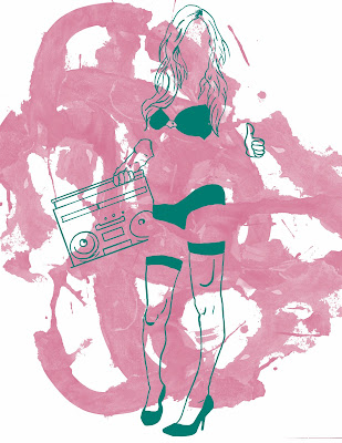
Here were some stuff that I was working on or worked. Here are some sketching, logo work, and various art pieces, whether they are completed or not. The one above is a sketch that I'm brought into the computer and will be touching it up in Photoshop.

Hungry Andy's was a logo design for this new sandwich shop down in Baltimore, Maryland. This is only the black and white version.


This was a fun pinup sketch, that I would like to continue working on.


Woman paint like sketch.

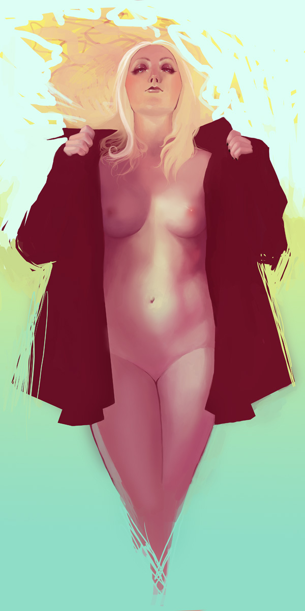
Playing around with the wacom pen with this woman laying down sketch.

Negative Woman


This one wasn't, but I just wasn't satisfied with the outcome. It says "Champion" in Spanish.

Tyler Stout X Star Wars Posters Available at Mondotees.com


If you go to http://www.mondotees.com/# You can have a chance to buy some exclusive and limited edition posters done by Tyler Stout. I'm no Star Wars buff and I think it's just another movie series with one of the most badass characters (Darth Vader), but I don't think it should have the worship it does. To each his own. I do agree that these posters are top notch. There are a couple color variations, so you have options. Act now, because these are sure to go fast.


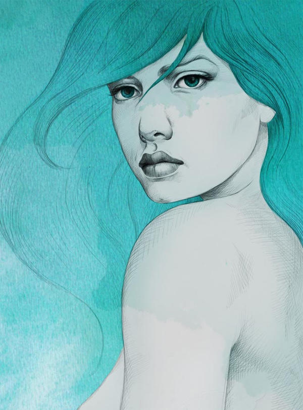
Turquoise by Diego Fernandez


What is amazing about this illustration is that everything was created in Photoshop. I asked him if he drew this and then brought it into the computer, soon I found out I was wrong. This piece is so simple, but eye catching. The color makes it pop the most, but I find it inspiring when he told me, "It was made completely with photoshop, the lines and the color."I thought that was great. I find that inspiring, because it takes illustration to another level. I'm still messing around with the linework in Photoshop and find creating vector art in Illustrator easier, but works like this makes me want to continue practicing. The sketch feel makes this such an authentic feel, plus I like that their are certain spots on the skin like the face, where it looks as though it is stained by accident. What do you think about this piece?

Here is a previous post on another illustration of Diego Fernandez's

Thursday, December 30, 2010

Metal Ink website is up for sale


I made a post about Metal Ink Shop last February about saving the site, but now this once tattoo style t-shirt contest site is up for sale. It had the potential to be a really good site, but when you're doing a contest site and you're constantly dishing out cash prizes, you need to be making some revenue to compensate for the prizes. It's a shame that companies like these go under or any company for that matter, but you need traffic and people buying to continue. Yes, you may have plenty of artists compete, but I know some that although they do submit they do not buy. I always thought that was odd to create a certain look many times, but not interested in purchasing anything similar that, just designing it. I feel with contest sites you should like what they're selling or if you're submitting you would definitely wear what you created. It bugs me, since this is not a job, but more a fun part of the graphic design field. I don't know. Either way contact info@metalinkshop.com and maybe you can revamp this site to your own liking. Maybe a clothing line with nothing, but metallic ink on all apparel. Just a thought.

Random hot rod t-shirt design

I wanted to create a hot rod design, so I did and mocked it up on a tee. I wanted to create some simple and effective as well as making something a bit vintage.

Tuesday, December 28, 2010

Inspiration: Florian Nicolle w/ Step By Step Process


I was browsing on Behance and came across some of the illustrations by Florian Nicolle. I must say there is  pretty cool stuff. The blending of traditional media and digital media is always fun, but the majority of the legwork is traditional. Nicolle adds some texture in Photoshop of course to help make an amazing illustration shine even more. This is the artist statement on these illustrations:

I try to create an image that retains its freshness of the first paint stroke, the expressions of the line have to be very free and spontaneous. While keeping a rigorous drawing. So i use fast techniques like a bic, large brush, watercolor and chines ink then I add texture and details on Ps.

i use much texture of text, because it adds a presence of hand. I draw a picture as if I wrote a text, with the same tool, the same freedom, with erasures, lines, scribbles etc


You can view more work from this French Graphic Designer here: http://www.behance.net/neo_innov  or http://www.neo-innov.fr/


Here is the step by step process:

1. Background

2. White Splash

3. Pencil


4. Black stroke with chinese ink


5. Water Color ink

6. Details in Photoshop


7. Integration of "Billie Jean" lyrics on forehead in Photoshop


Monday, December 27, 2010

There's no stopping on Snow Days


For those of us on the east coast, we have been recently hit by a snow storm, which caused plenty of places to shut down. Yes, New York City jobs are closed....most. Now after shoveling, what is a person to do besides relax? There's plenty to do for all those graphic designers that want to keep themselves occupied on a snow day after you finish your hot chocolate. Here's a short list and I'm sure there are more you can add to. Feel free to comment on more to do.

Freelance- Some designers are freelancers so there's no such thing as a snow day, but to those who work a full time day job, you can look for extra jobs to do or work on those jobs that you finally have time to do, but couldn't for whatever reason.

Personal Designs- This is the most fun, because there are no limitations. You can experiment and create whatever you feel like working on. This is the best time to catch up or learn new techniques. Design is always evolving, so who knows maybe you'll set the next trend or perfect what's out there.

Read design blogs- Yes, you can do this during a lunch break, but now you have time to read all the blogs that you want. You can participate in any discussion that you think is worth commenting on. Maybe there are articles that you find very intriguing, either way it is an option and it always good to rest the creative mind, especially if you happen to be in a creative block.

Search for inspiration- This is similar to the option above, but not every blog has inspiration posts. You can search through various portfolio sites and see what is out there. Who is the next designer to inspire you to try something different or help push you?

Practice tutorials- Whether you read a tutorial from a magazine or online, it is good to learn something new and try incorporating it for your own educational purpose.

Work on your portfolio- Update your portfolio. Redesign your portfolio site or simply showcase your new work. It's always a good idea to keep up to date with it.

Build a snowman- This one is just for fun. It's not everyday that you have the option to do so. This can be your creative outlet.

There you have it, a short list of activities to do on a snow day. If there are more that you would like to contribute then please comment.

Thursday, December 23, 2010

Little Drummer Kinetic Type Video

Since it is the holidays, it's only right to post some more holiday designs. Thank you to the reader who suggested I should check this video out. Here is a kinetic type video of the Christmas song "Little Drummer Boy". Enjoy.

Ray-Ban Rare Prints by Andreas Krapf


Andreas Kraphf was hired to create some illustrations for Ray-Ban posters. He was assigned to have his design based on the "swirl-pattern" of their glasses. He made everything in Vector and it's insane to see the path view in Adobe Illustrator for this design. To view more click here

The rough sketches


Path view in Illustrator


Tuesday, December 21, 2010

Tron Inspired Poster


It just so happens I'm listening to the TRON soundtrack and must say Daft Punk did an incredible job. The music has me cooking up some creative concepts. Artist Francois Hoang was inspired by the promotional designs for this movie and decided to come up with his own contribution. He uses a quote from the Jeff Bridges character, Kevin Flynn.

To view more work from Francois Hoang click here http://www.behance.net/AoiroStudio 

Friday, December 17, 2010

Inspiration: Ray Masaki

I met Ray Masaki a couple months ago, who's a very talented guy from illustration and animation. He's a student at Parsons I believe. Ray is rebranding his clothing line Lowdtown. He has a couple videos on his youtube of his drawing process. Here are two videos that I like and would like to share. Look for him in the future.

For more videos make sure you go to his youtube page at: http://www.youtube.com/user/lowdtown


Thursday, December 16, 2010

Christmas Whisper, A holiday sketch

Here's a small illustration for the holiday season. I used Photoshop to ink and color, in case you were wondering. Tis the season to be jolly!

Tuesday, December 14, 2010

College Humor - Photoshop Tutorial Rap

I thought this was funny, especially since everyone is a graphic designer and uses photoshop. It's a funny song from rapper CMYKilla. I know the name is great. Enjoy

Free Shipping & Low International shipping from Branded Baron

Free shipping from Branded Baron for all domestic orders. International orders have low shipping too! Some shirts are on sale and others aren't, but with top quality it's definitely worth every pretty penny. Order now, so you can get some great items for Christmas!

Saturday, December 11, 2010

Wolverine Digital Painting Video

This is a cool video of a Wolverine digital painting by Kenneth Kristensen. I always enjoyed watching the process from the beginning to end of videos like these. This time you'll see the whole digital painting, which looks like two paintings with the final outcome being merged. You'll have to enjoy and appreciate what is done.

Friday, December 10, 2010

Tuesday, December 7, 2010

Cavata Clothing Hoodies, Beanies, & Belts available tomorrow!


The people at Cavata Clothing are releasing new items tomorrow. You can get a hoodie, which has their logo distressed, a beanie either in gray or black, and a belt. I do own two tees from them and they hook it up with some goodies. Plus, the designs are quality and their logo is a favorite of mine. The logo is so simple and clean, but it definitely represents them. I'm a fan of what they're doing and everything is amazing. The hang tag looks like a concert ticket and that alone makes their company awesome. I forget, but I know that it's either 10% or 15% of sales goes to helping art and music programs. They definitely are doing something right and for a good cause.


ShirtFight.com $5 FINAL SALE


So, Jud of ShirtFight.com has put all the men and women t-shirts for $5. Some sizes are sold out, so pick up a shirt before your size is sold out. I previously owned a Shirt Fight tee. The Beautiful Outlaw by Evanimal(below). Unfortunately most of the sizes are gone in that design except XL and XXL in men, but if you're that size I recommend this shirt, since it is one of their best designs.  I snagged the Knuckle Collision, which needed a reprint and now only XL are left.  The shirts are printed on American Apparel and are

Also, the site is up for sale, so if you're interested or know of someone who's interested investing in the domain and website you should contact Jud. This site was a t-shirt competition site and could be back up and running again with a new owner. It had great potential, I'm not a fan of most of the designs, but there were some pretty good ones. Maybe it can be someone's brand or another competition site or a cool blog, the possibilities are there. In the meantime whatever is left try and buy it.

One more thing, Jud predicts there may be some shirts left over and would like to donate the rest to a charity. If you know of a charity, please e-mail him.

SALE ENDS Dec. 15th!


Monday, December 6, 2010

How to design the Perfect Business Card Link


Just like a logo and portfolio, you need to stand out and a business card is very important. A well thought out business card can help you be remembered from a potential client and that is key when you're looking for more business. When meeting with someone or networking, what do you often exchange? Business cards. Read this article, because I think there are some good points made.

http://www.webdesignerdepot.com/2010/11/how-to-design-the-perfect-business-card/

Sunday, December 5, 2010

50 Great Tees For Everyone On Your Holiday List!


Iamthetrend.com has a post that can help you with your holiday shopping! There are a bunch of categories such as shirts for the "drinker/partier", "music lover", "artsy/creative", and more. Brands I recommend from that list are Fullbleed, Branded Baron, Cavata Clothing, Miles To Go Clothing, Prestigious, and Rethink Clothing just to name some.

Check out the highlighted shirts and pick one up or more. Each brand also has more items, so check them out if you like. Read here:http://iamthetrend.com/2010/12/02/50-great-tees-for-everyone-on-your-holiday-list/

Friday, December 3, 2010

Link: The Marketing Magic Behind Harry Potter


This a very good article whether you're a small company or someone with a product and looking to expand into business. There are five points discussed in this article. They are:
1. A Good Product
2. Emotional Involvement
3. Word-of-Mouth Marketing and an Online Buzz
4. Tease and Perpetual Marketing
5. Brand Consistency and Restraint


I feel even as a design you can use what is said in the article and help market yourself as a designer. Maybe you do not agree with what is mentioned, but it a good article to have seen.

"The story of Harry Potter on the printed page and big screen is just as magical as the story of Harry Potter from a marketing and branding perspective, and it's one that all marketers and business owners can learn from.
Here are five key elements that helped drive the success of the Harry Potter brand, which small business owners can implement, too. While your level of success might not reach the multi-billion dollar brand value that Harry Potter has reached, by applying these strategies to your marketing plan, you'll position yourself for long-term, sustainable business growth."